
5 immediate changes you will love with iOS 18 coming this Fall
I have been playing around with the iOS 18 public betas for a while now, and without really trying to find every new feature, here are the top 5 features I have appreciated the most, and I think you will love as well:
I have been playing around with the iOS 18 public betas for a while now, and without really trying to find every new feature, here are the top 5 features I have appreciated the most, and I think you will love as well:
Require Face ID to open an app
This is a huge feature since it allows you to hand your phone over to others (like my kids) without them getting access to sensitive apps like social media, YouTube, etc. All you have to do is long press on an app, and select the “require FaceID” option, your face is scanned, and now the app will always require a FaceID scan (or password). Simple as that.

Require Face ID: A simple yet effective security measure.
2. Move app icons anywhere on screen
Yes, we know, Android has had this feature for more than a decade, but it’s finally here for iOS. It still acts weird when you try to move your icons anywhere you want and iOS tries to shift your other icons around, but I’m sure the bugs will be fixed before its September release. Now you can have a picture of your kids on your home screen and arrange your icons in a way so that you can still see their faces.

Your lovely wallpapers of your family now don’t have to be blocked by annoying icons (cat lady edition).
3. Call screen now avoids accidental butt dialing
This was a huge one, and avoids awkward situations where you accidentally tapped someone on your recently called list and have to awkwardly end the phone call. Clicking on the recent call entry now takes you to the call details screen instead of automatically calling them back, and in order to call back, you simply hit the phone icon at the far right.

A simple call button on the side makes a big difference in avoiding accidental dial backs.
4. T9 dialer to search contacts
Ah yes, the good ol’ T9 dialer to search contacts. This was a feature I used daily before I joined the Apple ecosystem, and now we finally have it back on the iPhone. If you are in your 40s like I am, you know what this is all about.

Dial any part of a name or number, and you'll find what you need instantly.
5. The Passwords app
This is by far the most noticeable one since the icon will be slapped right on your homescreen. This is a huge deal for me and probably for most of us since we have tons of passwords, and it is no longer buried in the settings app. If you don’t already have a Password manager, then odds are you use the same password for many services, which is going to bite you hard.

You can't miss the new passwords app since it will be on your homescreen the minute you install iOS 18.
Banning phones from schools: Is it possible?
Ben Lovejoy from 9To5Mac:
“More schools are banning students from using smartphones in classes, with calls for a federal ban rather than the current mix of state laws. Apple’s home state of California is expected to be the next state to introduce a ban.
Orlando has so far taken the toughest line, banning smartphone use during the entire day, and blocking access to social media networks on the school wifi …
Worldwide, around one in four countries has implemented bans or restrictions on the use of smartphones in schools. A 9to5Mac poll conducted a year ago found strong support for the same happening in the US, with 73% in favor and only 21% opposed.
The three arguments made for such bans are:
1. Improves learning outcomes
2. Reduces classroom disruption
3. Protects children from cyberbullying
Within the US, four states have already implemented bans, or are in the process of doing so: Florida, Indiana, Louisiana, and South Carolina.”
A federal ban would be the best option since it would be one blanket law rather than a hodgepodge of different laws. Realistically though, we will probably see a few case studies of success in a few schools across the nation.
It will be a slow process, but implementation is the real challenge.
Continuing further:
“A survey conducted by the National Parents Union revealed that 70% are in favor of a ban, though the majority think this should be restricted to class times, with students allowed to use phones at lunchtime and during official breaks.”
Giving them access during lunch hours doesn’t solve the issue because that is supposed to be a time for ACTUAL socializing with one another, but it will end up being a bunch of people on their phones trying to get the latest FOMO itch scratched. Maybe not through social media, but through games, texting, and the list goes on.
Another question, will a simple VPN app remove these protections from getting social media access on school wifi?
Ben Lovejoy from 9To5Mac:
More schools are banning students from using smartphones in classes, with calls for a federal ban rather than the current mix of state laws. Apple’s home state of California is expected to be the next state to introduce a ban.
Orlando has so far taken the toughest line, banning smartphone use during the entire day, and blocking access to social media networks on the school wifi …
Worldwide, around one in four countries has implemented bans or restrictions on the use of smartphones in schools. A 9to5Mac poll conducted a year ago found strong support for the same happening in the US, with 73% in favor and only 21% opposed.
The three arguments made for such bans are:
1. Improves learning outcomes
2. Reduces classroom disruption
3. Protects children from cyberbullying
Within the US, four states have already implemented bans, or are in the process of doing so: Florida, Indiana, Louisiana, and South Carolina.
A federal ban would be the best option since it would be one blanket law rather than a hodgepodge of different laws. Realistically though, we will probably see a few case studies of success in a few schools across the nation.
It will be a slow process, but implementation is the real challenge.
Continuing further:
A survey conducted by the National Parents Union revealed that 70% are in favor of a ban, though the majority think this should be restricted to class times, with students allowed to use phones at lunchtime and during official breaks.
Giving them access during lunch hours doesn’t solve the issue because that is supposed to be a time for ACTUAL socializing with one another, but it will end up being a bunch of people on their phones trying to get the latest FOMO itch scratched. Maybe not through social media, but through games, texting, and the list goes on.
Another question, will a simple VPN app remove these protections from getting social media access on school wifi?
The Kids Online Safety Act is pointless.
Lauren Reiner from The Verge:
The Senate passed the Kids Online Safety Act (KOSA) and the Children and Teens’ Online Privacy Protection Act (also known as COPPA 2.0), the first major internet bills meant to protect children to reach that milestone in two decades. A legislative vehicle that included both KOSA and COPPA 2.0 passed 91–3.
Senate Majority Leader Chuck Schumer (D-NY) called it “a momentous day” in a speech ahead of the vote, saying that “the Senate keeps its promise to every parent who’s lost a child because of the risks of social media.” He called for the House to pass the bills “as soon as they can.
How does this bill work exactly?
The bill works by creating a duty of care for online platforms that are used by minors, requiring they take “reasonable” measures in how they design their products to mitigate a list of harms, including online bullying, sexual exploitation, drug promotion, and eating disorders. It specifies that the bill doesn’t prevent platforms from letting minors search for any specific content or providing resources to mitigate any of the listed harms, “including evidence-informed information and clinical resources.”
Creating a “duty of care” and taking “reasonable” measure are such vague terms that this Act is merely just that…
an act.
The real problem isn’t trying to regulate social media and the internet for kids. The real problem is the absence of parenting. There are plenty of teachers who would love for phones to be banned during school hours, but that solution would not be pleasing to the tech giants.
Ferrari Exec Thwarts a Scammer
Nico DeMattia from TheDrive:
“According to Bloomberg, the scammer reached out to a Ferrari exec through WhatsApp pretending to be Ferrari CEO Benedetto Vigna. The scammer reportedly asked “Hey, did you hear about the big acquisition we’re planning? I could need your help.” While the WhatsApp number and photo were different than the real Vigna’s, the exec seemingly kept the conversation going, as the messages continued.
The scammer kicked things up a notch when they called the exec, using AI deepfake technology to mimic Vigna’s voice and even his southern Italian accent. According to the Ferrari exec, the deepfake accent was nearly perfect. However, the exec couldn’t shake the feeling that something fishy was going on, so they told the scammer that they needed to verify the caller’s identity. To do this, they asked what book Vigna recently recommended to them. The title was “Decalogue of Complexity: Acting, Learning and Adapting in the Incessant Becoming of the World” by Alberto Felice De Toni. Of course, the scammer didn’t know that—so they promptly hung up.”
That exec that was targeted did everything right.
1. He noticed the phone number was different.
2. He wanted to speak to the CEO to make sure it was from him.
3. The Deepfake sounded convincing but still the exec was not fully convinced, so he asked the deepfake a question that only the real CEO would know, which made the scammer hang up.
Nico DeMattia from TheDrive:
According to Bloomberg, the scammer reached out to a Ferrari exec through WhatsApp pretending to be Ferrari CEO Benedetto Vigna. The scammer reportedly asked “Hey, did you hear about the big acquisition we’re planning? I could need your help.” While the WhatsApp number and photo were different than the real Vigna’s, the exec seemingly kept the conversation going, as the messages continued.
The scammer kicked things up a notch when they called the exec, using AI deepfake technology to mimic Vigna’s voice and even his southern Italian accent. According to the Ferrari exec, the deepfake accent was nearly perfect. However, the exec couldn’t shake the feeling that something fishy was going on, so they told the scammer that they needed to verify the caller’s identity. To do this, they asked what book Vigna recently recommended to them. The title was “Decalogue of Complexity: Acting, Learning and Adapting in the Incessant Becoming of the World” by Alberto Felice De Toni. Of course, the scammer didn’t know that—so they promptly hung up.
That exec that was targeted did everything right.
1. He noticed the phone number was different.
2. He wanted to speak to the CEO to make sure it was from him.
3. The Deepfake sounded convincing but still the exec was not fully convinced, so he asked the deepfake a question that only the real CEO would know, which made the scammer hang up.
What happens if you buy an iPhone in one country, and want to use AppleCare+ in another country?
This would be a situation that I would be in because I live in the US and bought an iPhone from Saudi Arabia, and I wanted to know once and for all what would happen if I broke my iPhone.
I bought a phone from Saudi Arabia because I needed an iPhone with a physical SIM slot. My plan doesn’t support e-SIM yet, and I don’t think they will anytime soon since their plans are generally catered to older folks who don’t really use their phones that much.
At least that is what I think because who else offers unlimited data, talk, and text on Verizon’s network for only $10/month?!
Anyway, I went to Canada just a few weeks ago, and I went to an Apple Store to finally put the question to rest:
If I break my iPhone in the US, will Apple replace it with a US phone (without the SIM slot) or would I get the exact same phone that I purchased with the SIM slot?
The nice lady was helping out other customers, but she eventually made her way to the back and asked a specialist (or a genius?) about the situation.
She came back with the answer that I wanted to hear:
“So if you break your iPhone, Apple will replace it with the exact same iPhone. It might take an extra day or two to get it to you since it will probably come from somewhere else, but it will be the same iPhone with the SIM slot.”
That is good to hear, both for me right now, and when I inevitably sell my iPhone 15 Pro Max to buy the 16 Pro Max. I got another international trip lined up so let’s see if I can snag that come October.
The Best Apple Watch Band You Need
The Apple link bracelet is still the best premium Apple Watch band you can buy today.
There really is no comparison.
If you want the most premium Apple Watch band that money can buy, there is no other place to look.
There just so many reasons why this band always puts a smile on my face:
The Apple link bracelet is still the best premium Apple Watch band you can buy today.
There really is no comparison.
If you want the most premium Apple Watch band that money can buy, there is no other place to look.
There just so many reasons why this band always puts a smile on my face:
1. Timeless design
The unique look of the bracelet has held up very well over the last 10 years.
That's right, it has been almost 10 years since the Apple Watch came out, and this bracelet still looks better than ever!
The brushed links complement the finely-polished Stainless steel Apple Watches, and have a great patina over time with its micro scratches.
2. Easily adjustable
Due to the rigidity of the band, you can't just slide it off of each end of the Apple Watch while it is intact.
Apple solved that problem by making the links easily adjustable with no tools but your fingernails.
A simple click on the button on the link disconnects the bracelet, and allows you to remove each part of the band in seconds.
Simply clicking the disconnected links back together puts the band back together into one seamless piece, as if it could never be separated.
Seamless and smooth on the outside, while still being functional and easily user adjustable.
3. Gentle, yet elegant on the wrist
Even with my hairy arms, it never catches or pulls on hair, which is a great feature!
Sometimes I even forget that I'm wearing the link bracelet because of how smooth and light it feels on the wrist.
This is very important because the more you notice something and the more you feel something, odds are it will be cumbersome and annoying to you.
Think of a shirt tag that just drives you insane.
Remember, the less you notice something, the more it actually works for you.
How to Prepare for Apple Vision Pro Pre-Orders.
The Apple Vision Pro Pre-Orders will be on January 19th, starting at 5AM PT. Here are some tips that will make sure your devices are optimized in order to avoid any hiccups on Pre-Order day.
The Apple Vision Pro Pre-Orders will be on January 19th, starting at 5AM PT. Here are some tips that will make sure your devices are optimized in order to avoid any hiccups on Pre-Order day.
This applies to any iPad or iPhone with Face ID, as Face ID is required to pre-order the Vision Pro.
Download the Apple Store App - you will need this app in order to make your pre-order. Apple will require you to scan your face within the app in order to make sure they can provide you with the proper light seal and band size for your head.
If you already have the app, make sure it is up to date since it was recently updated on January 11th to support the face-scanning feature.
Update all your other apps - this is a precautionary step, as it can avoid any potential bugs and glitches from apps that might be unstable and cause phone crashes.
Restart your phone - this will clear the cache, RAM, and give the phone a clean boot that will make it more stable.
Backup your phone to iCloud - go to your iCloud settings and backup your phone so you have a clean backup of your device in case you have any issues during the next step…
Update your device to the latest software version - go to Settings > General > Software Update, and update your iPhone to the latest version.
Upload your eye prescription - if you have glasses or require reading glasses, it would be best to upload your prescription to the health app in advance in order to save time during the pre-order process.
In the Health app, go to “Body Measurements.”
Go to “Vision Prescription,” and follow the prompts to upload your prescription details.
Make sure your Apple Pay works in the Apple Store App - this is the key step, and can be the difference between you getting your Vision Pro on launch day or a few weeks later!
In the past, I have had issues where my address was somehow incorrect, even though I never had that issue before, so I had to adjust my address and re-enter my credit card info in order to make a purchase. Thankfully, I tested that out a day before an iPhone launch, so it didn’t delay my purchase during crunch time.
The best way to do this is to simply make a purchase on the Apple Store App and see if the transaction goes through. You can buy something cheap and cancel the order after it has been placed, but this way you will know for sure that your Apple Pay payment will go through fine on Vision Pro Day. After you have done all of this…
Backup your iPhone once again to iCloud - now you should be ready!
One final bonus tip: re-boot your iPhone before your Pre-Order time an hour or so beforehand, in order to clear any rogue background processes that might cause your phone to crash.
My custom MagSafe car setup.
This car mount from an obscure company on Amazon is by far one of the best MagSafe mounts that I have tried.
This car mount from an obscure company on Amazon is by far one of the best MagSafe mounts that I have tried.
For a measly $11, you get two different places to mount your MagSafe puck:
CD slot
Any surface with a 3M sticky base.
I use both spots on my car, depending on the season. Summer is perfect for the CD slot since I can keep the AC vent pointing to the back of the phone to avoid overheating the phone, causing the screen to dim. In the winter, I place my phone on a lower spot that has enough space for the 3M sticky mount.

Summer setup in the CD slot (top) keeps my phone cool, and the sticky mount (bottom) keeps my phone cool in the winter.
I jumped on the MagSafe lifestyle since I had the iPhone 12 mini back in 2020, and these mounts have held up quite well. They are almost 4 years old, and these plastic pieces haven’t warped or cracked in the past 3 years, even though I park in direct sunlight all day long.
Occasionally the pivoting ball does get loose, but a quick turn to tighten it makes it firm and like new.

CD slot option provides rubber grips that allow a secure hold.

3M ball joint mount has been holding up for over 3 years.
The 12 mini is a pretty light device, but I also purchased the 13 Pro Max, 14 Pro Max, and now the 15 Pro Max. The increased weight of these devices didn’t make the mount any looser, which is very reassuring.
The best part about these mounts is their modularity since you have to purchase the MagSafe charger separately. For $41, you have the two mounting options and Apple’s MagSafe puck which fits like a glove. If something does break, you can replace either the mount or the charger, but you won’t have to replace an all-in-one solution with an expensive replacement. If I ever need the MagSafe puck outside the car, I can just take it off in an instant.
The funny thing about all this is that, since I have a short commute to work and usually don’t have any low-battery issues, my goal from the beginning was to just have a nice magnetic mount without a proprietary case system. Before MagSafe, the only way to get a magnetic mount was to either glue a magnet to your iPhone or get a case plus a compatible mount. I hate cases on my phone, so these were never an option.
Once MagSafe was a reality on the iPhone, this was the time to get a magnetic car mount the way I wanted it.
This mount and standard MagSafe puck combo works 99% of the time, but if you hit a New York City bump in the road, it would knock the phone right off. This is more a limitation of the MagSafe magnet strength, and not really the mount’s fault. With the 15 Pro Max, I wanted to be a bit more careful with it since I bought it overseas and it has a SIM slot. Yes I have AppleCare+, but if I damage this phone, I feel like Apple will only give me the eSIM version as a replacement here in the US, which doesn’t work on my carrier. In order to prevent this, I made another modification for my phone’s best interest.
I bought Moment’s wall mount, which has a significantly stronger magnet than the standard MagSafe magnet. The wall mount diameter is bigger than the MagSafe charger, so it does not fit in the car mount cut out by itself. I would need to use the 3M backing of the wall mount and stick it to a MagSafe puck, which would fit directly into the car mount. I didn’t want to waste $30 on a MagSafe puck just to glue another piece to it, so I ended up buying a cheap MagSafe charger on eBay for $15, cut the wire off, and now I had my custom, modular, MagSafe mount with a stronger magnet.

Moment wall mount = stronger magnets.
Once again due to the modularity of this system, I can easily take this puck off and place it on either mount, so I have a stronger connection that is pothole proof.
I even bought another set for my wife’s car so I can use it on longer road trips. The stronger magnet is essential when tapping the screen during navigation, changing podcasts, etc. It provides more confidence knowing that a hard tap or road bump will still keep the phone safe and secure.
Three features I would like to see with iOS 18.
With iOS18 expected to have a radical redesign and more ambitious features, I would like to see these three features added in iOS 18 to make a more personal, consistent, and professional experience.
With iOS18 expected to have a radical redesign and more ambitious features, I would like to see these three features added in iOS 18 to make a more personal, consistent, and professional experience.
1. Extended Dynamic Island Capabilities
All notifications should be coming through the dynamic island, no exception. With its ability to expand to multiple heights and widths, it is a no-brainer for all notifications to come through the Island.
It would make it more seamless, and quite frankly, more dynamic.

All the different sizes of the dynamic island.
2. Fully functioning icon packs that are easy to configure
You can get custom icons for your iPhone, but in its current state, this is sort of a deal-breaker for me since custom icons cannot show the red badge notifications, making me think that I have no messages or emails when I have a ton to read.
I have certain icons that are clean and nameless, but I don’t need red badge notifications for them. Other apps I do need notifications for, so there’s a mix of apps with text and shortcuts without text. It’s too inconsistent and not as personal as I would like it to be.
The process for adding custom icons is also very cumbersome and time consuming with the shortcuts app.
Lastly, 3rd party icons should have access to the proper APIs to be dynamic icons, just like Apple’s Calendar and Clock icons.
Current setup (left) vs desired setup (right)
3. More Pro camera features
The stock camera app has been practically the same since its redesign in iOS7, but it needs more Pro features. A Pro iPhone should have the ability to set your white balance manually. There’s nothing worse than a video constantly changing color with auto white balance.
The biggest handicap of the Pro iPhones is that you can’t manually pick which lens you are using. Apple uses its algorithm to determine if your zoomed shot will be better with a crop of the main sensor vs the actual telephoto lens itself. This is very frustrating in awkward light situations where the telephoto lens will objectively be the better lens, but the phone still decides to use the main lens with a 5x digital zoom. I had to try to have the phone switch to the telephoto lens (which it finally did) in this grim scene below:

Main camera 1x zoom

Main camera cropped to 5x zoom - the iPhone thought this would be a better picture…

When the 5x telephoto lens here has sharper details and better bokeh.
I’m sure I will have more ideas on what I would like to see in iOS 18.
A journey to find a physical SIM slot iPhone 15 Pro Max.
When the iPhone 15 Pro Max launched, I was ecstatic, as I was every year. I had pre-ordered 3 different colors: Blue Titanium, White Titanium, and Natural Titanium. Black was completely out of the question. I didn’t really want a dark color at the time since I had a purple 14 Pro Max for a whole year, and I really was leaning towards one of the lighter colors.
When I got the 3 phones on launch day, I was distraught between two beautiful phones, the white and the natural. I loved the back of the natural, but I really loved the sides of the white titanium.
The slightly yellow tinge of the natural titanium looked like someone pissed on the white titanium phone.
The funny thing is, if I only got the natural phone, I wouldn’t know that the white phone would have a better sheen to it, and I would just be perfectly happy with the natural color. I don’t live close to an Apple store (about an hour away from the closest one), and I didn’t feel like waiting in line, so I had to buy them for myself to make sure I picked the color that would resonate well with me. I finalized my decision to keep the white titanium and to return the other two.
I was at the time with AT&T, and have been with them forever. I have been getting a shoddy signal at work for the last 9 years, but it didn't really bother me since I would use my company’s Wi-Fi. It would be annoying at times though when I had to either make or receive phone calls from work, and I would have to stand outside to have a conversation. I could go to Verizon and pay more money, but I didn’t feel it was worth the extra cash, especially in today’s environment where everything is already going up in price.
I thought to myself, “I have this brand new iPhone 15 Pro Max, and I get the same crap reception as my iPhone SE (1st gen) in the same building. Surely there must be a way to get a better provider for at least the same price.”
And then I remembered a friend of mine telling me that he was paying $10/month for unlimited everything with his Ting plan through a promotion he received. The catch was that you have to be a Ting home internet customer. Since I do have Ting as my home internet provider, I thought to myself to check their website to see if they still had this insane promo for only $10/month.
As it turns out, they still had the promo active, and I decided to try a line. Worst case, it won’t be any good and I’ll just be out $10. I had a feeling though that it would be great since they are using Verizon's towers.
I ordered a SIM, and it arrived in 2 days. Pretty seamless process, and I just inserted the SIM into my iPhone SE. When I went to work the next day, I couldn’t believe my eyes when I saw my iPhone SE having near full bars, and my 15 Pro Max stuttering along with just one bar. I tried it out for a few days, and I was able to even make video facetime calls over cellular at work, whereas with AT&T, I couldn’t even make regular voice calls!
So now the choice was obvious. Either I continue to pay $130/month with AT&T for 3 lines, or I could pay $36/month (about 12 bucks a line after taxes and fees) and save myself $94 dollars a month. This was a huge savings, especially once again in today’s inflated greedy economy where every corporation can keep raising prices because, who's there to stop them?
This was the clearest no-brainer for me in a long time. I still couldn’t believe that I would be getting unlimited data, unlimited hotspot, and no throttling.
There was one catch though, a HUGE catch.
And that catch would send me for a search halfway around the world.
The catch was that Ting only supports physical SIM cards, and does not support eSIM. That means that any US version of the iPhone 14 or later would not be supported.
The timing couldn’t be better though. I was planning a trip overseas to Makkah and Madinah for a religious pilgrimage, along with a family wedding, and it was coming up in a few weeks. I had to get packed for this trip, but now I also had to rush to send back my iPhones since I knew that they would be no use to me without a physical SIM slot. As much as I loved my iPhone 15 Pro Max in white titanium, it was time to part with it. Saving $94/month is just too good of a deal to keep an inferior provider. Plus if I didn’t return them in time, I would be over the return timeframe and would be stuck with over $4,000 in iPhones.
I did some research on Apple’s Saudi website to see where I could buy a phone, but the stores it told me were all saying that availability was sold out. There didn’t seem to be a reliable way for me to acquire this elusive iPhone 15 Pro Max with a SIM slot.
I also had to set my priorities straight. This trip was after all a spiritual trip first and foremost, and since there will be a lot of family present, there were dinner plans every day, along with other activities that would take up a lot of my time. The average amount of sleep on trips like these is about 4 hours, maybe 5. Of course there were the 5 daily prayers that would be prayed at the Grand Mosques, so I would have to find time in between one of the prayers to somehow acquire a phone.
Needless to say, time was extremely limited.
Before I could even do that, I needed a local SIM card since I had no service with Ting and the hotel Wi-Fi was a complete joke. Ting’s international plans are pretty expensive, and even if I wanted to activate it, it wouldn’t work in Saudi since I kept getting “No Service” in the status bar. The local SIM plans are pretty cheap, and I was able to get a 15GB plan for about $17.
Now I was finally connected to the world once again, so I could do some casual research to see where some of the cell phone provider stores were located. Later in the day, I had an epiphanic moment, “Fahad you idiot, why don’t you just ask the guys who sold you the SIM card where to buy an iPhone 15 Pro Max instead of trying to do the research yourself? They’re the locals, so they would definitely know!”
Since the teenagers who set me up with the plan spoke English (albeit, just enough to get by), I went back to them and asked them point blank, “Where can I buy… iPhone 15 Pro?” I said it just like that, leaving out the “an,” to come down to their level of speech. It’s a thing you do if you speak multiple languages. They immediately told me to go to the Jarir Bookstore. I said, “A bookstore?” They said, “Yes!”
First I thought to myself that they might have misheard me since I was not looking for books, but apparently Jarir Bookstore is like THE place to buy a phone. It never showed up as an official Apple retailer when I searched their Saudi website, but that website honestly didn’t seem that reliable to begin with.
I googled this store, and it wasn’t that far from my hotel, maybe around 15 minutes.
So my last day in Madinah was the day I would go to this store. My brother and I went after breakfast time, which was prime nap time, but sleep would have to wait for this iPhone 15 Pro Max, if they even had one. I couldn’t really call in advance since they weren’t open yet, but I would just have to bite the bullet and pray they had one.
We were able to flag a taxi pretty easily, as the taxi drivers are plentiful, ready to take you wherever you want to go. We had a couple of stops before the bookstore since they weren’t open yet, but once we got there at 8:45am, we just had to wait till 9am for them to open.
It was quite a grand store that could be best described as a mix between Barnes and Noble, Best Buy, and Target. Needless to say it was my favorite store, filled with all kinds of tech. Time wouldn’t allow me to peruse through the whole store, but I just had to get down to business.
I initially went to a booth that looked like a Best Buy Apple display area, but there was no one there to help me. Looking at where all the salespeople were, I turned my eye towards the counter that had practically all the latest Android smartphones from all the brands that are not mainstream in the US: Xiaomi, OnePlus, and Huawei. But it was time to see where the real phones were. Where were the iPhones?!
Instead of looking like a panther trying to catch its next meal, I decided to simply ask the gentleman at the counter without sounding desperate, “Do you guys have the iPhone 15 Pro Max in stock?” I was physically normal in my appearance, but mentally I was flinching to see what they would say. This could literally be my only chance to get this phone, since I would be leaving the following day to go to Makkah.
They did have some in stock! Now it was up to me to see if I wanted to purchase from what they had. At this point, beggars can’t be choosers. My goal was to get a 256GB or even 512GB white or natural titanium, but I might go with another color if I had to.
It seems that the popularity of the white and natural titanium phones is not only a US phenomenon, and the only phones they had were in blue or black with 512GB. They had a regular Pro in natural titanium at 1TB, but I wanted that 5x telephoto zoom.
I decided to go for the Black Titanium 512GB phone because I remember someone saying on Twitter-X that the black phone provides the most immersive experience with the edges disappearing into the color of the side rails. It was a $300 premium over the same phone if I had bought it in the United States, so that SIM card slot literally cost me $300.
I was still a bit nervous after purchasing the device because you can’t return anything here unless it has a defect. There is no return for buyer’s remorse.
Once I got back to the hotel, I unboxed the Black Titanium, and I was in awe of how the brushed metallic finish looked in black. It was better than I had imagined. Yeah it picks up fingerprints, but they can easily be wiped off with my shirt to reveal that shimmery brushed titanium. The look of the Black Titanium with natural light also gives a very striking graphite color that reminds me of a shiny pencil tip. I almost feel like if I rub the phone on paper, it will start writing!
Direct sunlight also shows off one of the titanium phone’s secrets: that lustrous particulate sheen. Under most lighting, the phone looks like brushed metal, but when under direct sunlight, it’s almost as if there is another texture that becomes active in the harsher light. The hue also changes a bit and you can almost see the whitish titanium underneath it, or maybe that’s just my slight desire to want this phone to be white.
Overall, I am glad I was able to get the Black Titanium, even though it wasn’t my first choice. The phone also worked flawlessly out of the box with no issues, so I wasn’t going to have to go through the whole return process. The Blue Titanium that I purchased on launch day did have a slight chip or discoloration on the back panel near the bottom, but this phone was flawless.
A story like this wouldn’t be complete if there weren’t some other plot twists, and there was a twist right at the end of my trip. While I was walking in the airport to find my gate for my flight back to Dulles airport, there was a Jarir Bookstore in the airport itself, and I decided to just ask the guy and see if they had a white titanium iPhone 15 Pro Max in stock.
Of course they did. 512GB too!
My beef with watchOS 10
Ever since watchOS 3, Apple has provided us with a very useful and convenient feature: The ability to easily swipe left and right to change watch faces.
Not anymore.
With watchOS 10, that feature is long gone, and doesn’t seem to be coming back anytime soon. It was missing from the earliest of watchOS 10 betas, and I was thinking that it will eventually come back in a future update. I naively kept waiting and waiting, but it seems to be gone forever.
A key navigation technique that millions have been using for years on their watches, and not a single peep about it from the tech community. Heck, even regular people should be pissed.
WatchOS 10 officially has the slowest method available ever to change watch faces.
A barbaric touch and hold, followed by scrolling right or left in the edit screen. Even the original Apple Watch had a faster way to change watch faces with its Force Touch ability giving you almost instant access to the watch face edit screen.
If Apple had used the swipe right and left gestures for a different function, that would have been one thing, but they completely removed the gesture altogether. I find it hard to believe that the gesture was in some way not compatible with Apple’s new control interface.
Currently a swipe up from anywhere on the watch face takes you to your Smart Stack. Maybe there could be some software "collisions" in detecting a swipe up from a left or right swipe? If that were the case, the Smart Stack gesture should only work when swiping up from the bottom of the display and not anywhere on the display. With this setup, you could easily avoid issues with left and right swipes.
Quite frankly, I don’t think that it is a software issue, since there are hundreds of apps with much more complex touch controls and gestures.
Hopefully Apple will bring back this gesture once they realize how much people miss the ability to switch watch faces on a whim.
Why normal people should buy the Apple Watch Series 9 and Apple Watch Ultra 2 models.
Usually when a new Apple Watch comes out, you can find great deals on the older models that would save you a ton of money, especially if you are in the market for a stainless steel version. With the Series 9 and Ultra 2 models though, the better deal is to go for one of these two new models, even at full price.
These are the two main reasons why you should go for the new Apple Watches:
New processor
The Apple Watch is not a slow device when it comes to doing ordinary tasks, but the new S9 chip has 60% more transistors than the outgoing chip, which will make it faster and more future proof. As a matter of fact, the Apple Watch Series 6, 7, and 8 all had the same processor, so this new S9 chip could easily be the chip for the next 3 years. Now what is this new chip capable of doing? Take the new on-board Siri for example.
Normally when I use Siri on the watch, there is a significant delay between my request and the result. I will tell Siri to turn off a specific lamp in my house, and it will take her around 10 seconds or more to turn it off. This was because Siri was not running natively on the watch, but would connect to the iPhone and then fulfill the request. With the S9 chip, Siri can now run natively on the watch, making requests faster and more secure. This will be a huge time savings for those who use Siri all the time.
Not only will Siri be even better, but the new chip enables the “Double Tap” feature. By pressing your index finger with your thumb twice, you can activate certain gestures, such as answering a call, snoozing an alarm, and even scrolling through your Smart Stack. Even though the Double Tap feature existed before in accessibility mode under AssistiveTouch, it is not as user friendly and is not as accurate. Apparently the new neural engine is what makes the Double Tap feature more accurate.
Better brightness controls
With the Apple Watch Series 9, you can go all the way up to 2000 nits in brightness, which is double that of the Series 8 and equal to last year’s Apple Watch Ultra. The Ultra 2 goes from 2000 nits to 3000 nits, which is an insane level of screen brightness. It will not just be visible in the harshest of sunlight, but it will look and feel bright.
Even though brightness usually isn’t a huge deal for most people, what is a huge deal is how dim a watch can get. Both these watches can go down to as low as 1 nit, which means you won’t be bothered by the higher brightness of your watch in low-lit environments. Your wife won’t groan and complain about your annoying watch blasting her dilated pupils, and people next to you in the theater will no longer give you that scowling glare to turn off your watch.
In other words, the new Apple Watches will improve your relationship with those around you. Now can you really put a price on that?
Which watch should I pick?
That is a personal preference based on design, battery life, and oh yeah, price. The Apple Watch Ultra 2 starts at $799 and the Series 9 at $399. The Series 9 is literally half the price of the Ultra 2, but gives you 98% of the features of the Ultra 2. You don’t get the siren, extreme GPS and diving features, nor the Action Button, but are those features really worth an extra $400? Even the extra battery life might not justify the price because since they both support fast charging, you can get your watch charged from 0 to 80% in 45 minutes to an hour, depending on the watch.
The Series 9 with GPS and Cellular starts at $499, but even the $300 difference is a hard pill to swallow.
If you were eyeing the Stainless steel versions of the Series 9, which start at $699, then it would be a better buy to get the Ultra 2 since you would get all those extra perks for only $100.
Whichever one of these two watches you pick, you will be happy, up to date, and will have a watch that can easily last 5 years if not more.
Why we should (but probably won’t) get live Apple Events
It was WWDC 2019, & the tech community was excited to see the release of the new Mac Pro and Pro Display XDR.
While Apple knocked it out of the park with these two new products, what came next was something they never expected…
Even though both products were expensive, they were a great deal when compared to similar competitive products. A PC with comparable specs to the base Mac Pro was over $8,000.
The Mac Pro Price? $5,999.
The audience cheers.
The Pro Display XDR was also an expensive product, but people knew that it was a great deal for the specs. Most reference monitors were in the tens of thousands of dollars, and Apple “referenced” a $43,000 monitor (see what I did there?).
If the reference monitors are $40K, how much will Apple’s display cost?
The Pro Display XDR was $4,999.
Great positioning and marketing.
The audience cheers.
What came next though stole the show. Apple announces its VESA mount for $199, and then the ProStand for $999.
NINE HUNDRED AND NINETY NINE DOLLARS.
The shock, horror, and groans heard around the world!
I think it caught John Ternus by surprise a bit, but I love his reaction. He kept going and put a smile on his face, knowing that we would buy it anyway.
A classic moment indeed.
How the iPhone 15 Pro Action Button will Probably Work
As much as I would rather have a physical mute switch toggle on my iPhone, it looks like the action button will be taking its place. bring much more functionality since it can easily give you five different functions instead of just two. Here is how I think Apple will implement the action button.
The simplest and most effective way to implement the action button is to copy the power button. The power button currently has five different functions:
Press and hold - activates Siri
Press once - turns on/off the screen
Press twice - activates Apple Pay
Press three times - activates your accessibility shortcut options
Press five times - activates the emergency SOS screen
If Apple uses this approach, we can get five more custom functions from the action button. Might be too confusing initially, but eventually I think people will get used to it. Ergonomically speaking, the action button is in the perfect spot for left handed users. You can easily thumb press the action button with your left hand, and your index finger can easily activate the longer power button. Right handers will have to perform some gymnastics to be able to press the action button with their index finger, but it’s not a comfortable hold trying it out on the 14 Pro Max and even the smaller iPhone 13.
What would I do if I had five more extra buttons? Here is my action button setup:
Press and hold - unmute phone
Press once - mute phone
Press twice - activate camera
Press three times - activate voice recording
Press five times - call my wife
I need my phone to be on mute at certain times, and a simple press should do the trick. Even if I am not sure if my phone is on mute, I can simply press the action button once and voila! Plus, I would rather be on mute when not needed than not be on mute when needed, which is why I would rather press and hold to unmute the phone. Plus with this setup, it still allows me to mute the phone without putting my hand in my pocket.
The other 3 functions are in order of convenience and need. Quick camera access is a huge plus, and even voice recording might come in handy if you wanted to “jot down” your thoughts and ideas. Lastly, having the ability to reach my wife would be a great feature if I am in an emergency and my screen gets damaged. A lot of the times a damaged screen will hinder the ability to get help since it won’t register any touch input. Having a physical button to instantly call a loved one will definitely be handy.
As much as I would rather have a physical mute switch toggle on my iPhone, it looks like the action button will be taking its place. bring much more functionality since it can easily give you five different functions instead of just two. Here is how I think Apple will implement the action button.
The simplest and most effective way to implement the action button is to copy the power button. The power button currently has five different functions:
Press and hold - activates Siri
Press once - turns on/off the screen
Press twice - activates Apple Pay
Press three times - activates your accessibility shortcut options
Press five times - activates the emergency SOS screen
If Apple uses this approach, we can get five more custom functions from the action button. Might be too confusing initially, but eventually I think people will get used to it. Ergonomically speaking, the action button is in the perfect spot for left handed users. You can easily thumb press the action button with your left hand, and your index finger can easily activate the longer power button. Right handers will have to perform some gymnastics to be able to press the action button with their index finger, but it’s not a comfortable hold trying it out on the 14 Pro Max and even the smaller iPhone 13.

A left hand grip makes it easy to press both the action button and power button.

It might not look like it, but the reach for the action button with your right hand is very uncomfortable and unnatural.
What would I do if I had five more extra buttons? Here is my action button setup:
Press and hold - unmute phone
Press once - mute phone
Press twice - activate camera
Press three times - activate voice recording
Press five times - call my wife
I need my phone to be on mute at certain times, and a simple press should do the trick. Even if I am not sure if my phone is on mute, I can simply press the action button once and voila! Plus, I would rather be on mute when not needed than not be on mute when needed, which is why I would rather press and hold to unmute the phone. Plus with this setup, it still allows me to mute the phone without putting my hand in my pocket.
The other 3 functions are in order of convenience and need. Quick camera access is a huge plus, and even voice recording might come in handy if you wanted to “jot down” your thoughts and ideas. Lastly, having the ability to reach my wife would be a great feature if I am in an emergency and my screen gets damaged. A lot of the times a damaged screen will hinder the ability to get help since it won’t register any touch input. Having a physical button to instantly call a loved one will definitely be handy.
iPhone 15 Pro Action Button
Steve Moser from MacRumors:
“The Action button, which could be similar to the Apple Watch Ultra's Action button but with more phone-focused options, is expected to be a new physical button on the next-generation Pro iPhone models that replaces the Ring/Silent switch. The Action button would allow users to quickly access various functions and settings without necessarily unlocking the device or navigating to an app.
According to the code found in iOS 17 beta 4, the Action button could have nine different options that users can customize and assign to different actions.”
My biggest beef with the new iPhone15 Pro action button is going to be its versatility in the pocket. The mute switch lever was an easy, stealthy way to silence your phone, but now you won't really know if it's silenced if you just try to press a button to silence it. You will have to think, "Did I just mute my phone or did I just unmute it?" The positioning of the mute switch lever just by feeling it would always be a tell tale sign with full confidence of your phone's status.
Steve Moser from MacRumors:
The Action button, which could be similar to the Apple Watch Ultra's Action button but with more phone-focused options, is expected to be a new physical button on the next-generation Pro iPhone models that replaces the Ring/Silent switch. The Action button would allow users to quickly access various functions and settings without necessarily unlocking the device or navigating to an app.
According to the code found in iOS 17 beta 4, the Action button could have nine different options that users can customize and assign to different actions.
My biggest beef with the new iPhone15 Pro action button is going to be its versatility in the pocket. The mute switch lever was an easy, stealthy way to silence your phone, but now you won't really know if it's silenced if you just try to press a button to silence it. You will have to think, "Did I just mute my phone or did I just unmute it?" The positioning of the mute switch lever just by feeling it would always be a tell tale sign with full confidence of your phone's status.
Untitled Folder Wallet - First Impressions
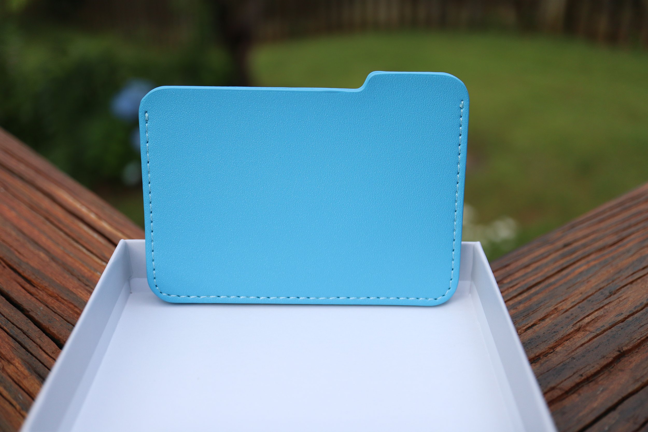
I was scrolling through Twitter and came across this wallet that I just had to have. I mean, what could be cooler than a wallet shaped like a Mac folder? The price was pretty steep at $60, but it truly is a unique product that you won’t find anywhere else. The FOMO in me picked it up immediately, but now you can get it for $50.
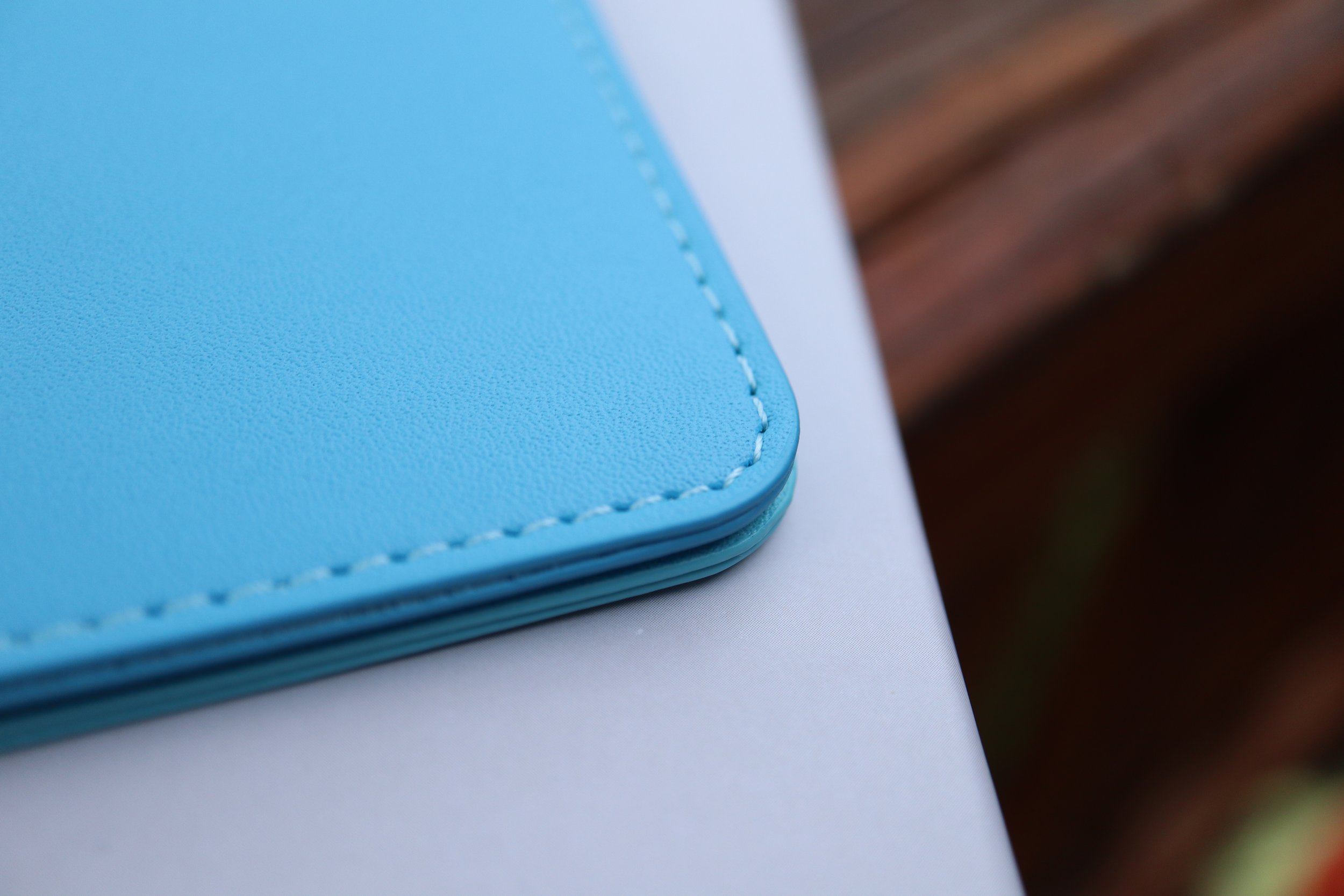
It comes in a pretty unassuming box with San Francisco font, and the wallet inside is in a plastic sleeve, nothing else. Pretty basic packaging. The wallet itself though is made very well and would make an Apple designer pleased, minus the fact that it is made of vegan leather. The surfaces have a nice even texture and the inner lining is smooth. There is no spot on this wallet where you feel a rough edge or notice any sort of poor stitching. Since this is a low volume product, I can see that careful attention to detail was a top priority.
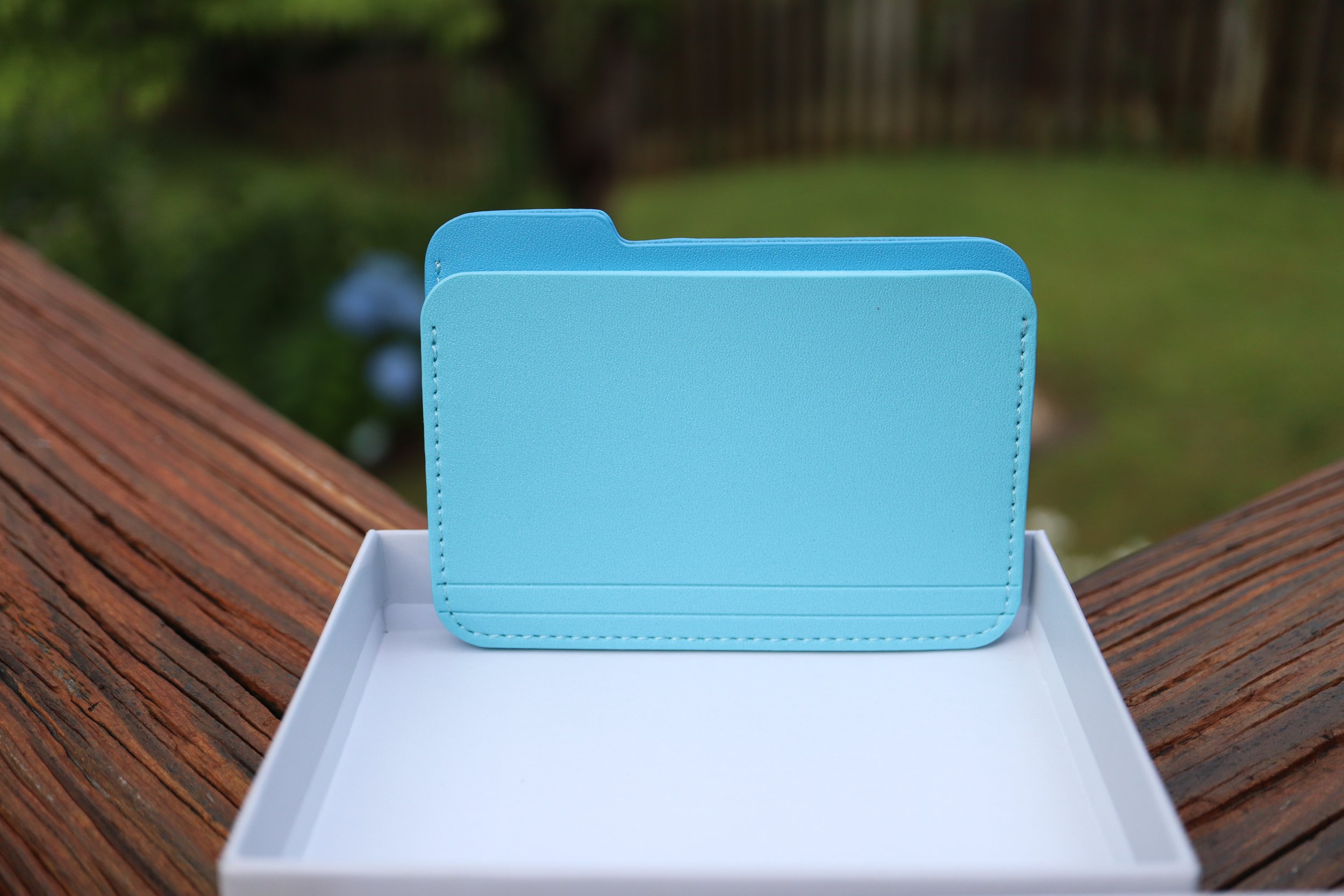
The wallet is essentially two sleeves stitched together, but you wouldn’t notice that just from looking at it from the front or the rear. I only have six plastic cards and one paper card in my current wallet, and this wallet can handle that in each pocket with ease. Having seven cards in each pocket will probably stretch out the wallet permanently, so my seven total cards will still keep it pretty slim with room to grow. That being said, the minimalist design of this wallet makes it more suitable for those who carry less, since this wallet’s whole purpose is form over function.
One thing that confused me was the website description; it says two pockets under the description, but the image next to it says three slim pockets. Technically there is a third, vestigial pocket which is the stitching joining the two main pockets, but it isn’t very useful. It is a great place to put an emergency bill of cash for those instances where cash is king. I was able to fold up a $1 bill into a square and fit it in there.
My main concern with this wallet is to see how durable it is. Will it fall apart? Will it discolor easily? I have made it my daily driver wallet for now, so I will see how it holds up after one month. Stay tuned.
I was scrolling through Twitter and came across this wallet that I just had to have. I mean, what could be cooler than a wallet shaped like a Mac folder? The price was pretty steep at $60, but it truly is a unique product that you won’t find anywhere else. The FOMO in me picked it up immediately, but now you can get it for $50.
It comes in a pretty unassuming box with San Francisco font, and the wallet inside is in a plastic sleeve, nothing else. Pretty basic packaging. The wallet itself though is made very well and would make an Apple designer pleased, minus the fact that it is made of vegan leather. The surfaces have a nice even texture and the inner lining is smooth. There is no spot on this wallet where you feel a rough edge or notice any sort of poor stitching. Since this is a low volume product, I can see that careful attention to detail was a top priority.
The wallet is essentially two sleeves stitched together, but you wouldn’t notice that just from looking at it from the front or the rear. I only have six plastic cards and one paper card in my current wallet, and this wallet can handle that in each pocket with ease. Having seven cards in each pocket will probably stretch out the wallet permanently, so my seven total cards will still keep it pretty slim with room to grow. That being said, the minimalist design of this wallet makes it more suitable for those who carry less, since this wallet’s whole purpose is form over function.


One thing that confused me was the website description; it says two pockets under the description, but the image next to it says three slim pockets. Technically there is a third, vestigial pocket which is the stitching joining the two main pockets, but it isn’t very useful. It is a great place to put an emergency bill of cash for those instances where cash is king. I was able to fold up a $1 bill into a square and fit it in there.
My main concern with this wallet is to see how durable it is. Will it fall apart? Will it discolor easily? I have made it my daily driver wallet for now, so I will see how it holds up after one month. Stay tuned.
watchOS 10 - a huge mental shift for veteran Apple Watch users.
I have been a veteran Apple Watch user since its release in 2015 and after almost two weeks, I still have trouble remembering the controls in watchOS 10. It is going to be a decent learning curve for those upgrading from watchOS 9, but it will also be a fresh start for those who are new to the Apple Watch experience.
In this post, I’m going to go through every single input option on the Apple Watch, and let you know the differences to expect when you upgrade to watchOS 10. Before we get into the input options, know that watchOS 10 essentially has 3 separate layers that flow from one to another. They flow in the following order:
Note: watchOS 10 Developer Beta 1 was used for this writeup.
I have been a veteran Apple Watch user since its release in 2015 and after almost two weeks, I still have trouble remembering the controls in watchOS 10. It is going to be a decent learning curve for those upgrading from watchOS 9, but it will also be a fresh start for those who are new to the Apple Watch experience.
In this post, I’m going to go through every single input option on the Apple Watch, and let you know the differences to expect when you upgrade to watchOS 10. Before we get into the input options, know that watchOS 10 essentially has 3 separate layers that flow from one to another. They flow in the following order:

Smartstack is new with watchOS 10, and it’s very robust and almost looks like a new watch face in and of itself. If you divide the watch into 4 quadrants, you get a clock in the top right, the day and date in the top left, and the bottom half of the watch lets you add up to 8 widgets. Each widget is the size of the big, full-width complication in the modular watch face.
Okay, so let’s get to all the control changes in watchOS 10.
Touch Controls
Swiping down from the top of the screen - this is the same on both watchOS 9 and 10. You get to see your notifications like normal. No retraining here.
Swiping up from the bottom
watchOS 9 - Control Center.
watchOS 10 - you get the new Smart Stack feature. Keep scrolling past Smart Stack to enter your app grid/list. This is a huge mind shift for veteran watch users, and I still get annoyed when I realize that I’m doing it wrong when trying to access Control Center.
Swiping left to right (or right to left)
watchOS 9 - This changes your watch face at the flick of a finger.
watchOS 10 - Changing your watch face in this manner is unexplainably removed from the first beta. I really hope it will be added back because you now have to touch and hold the watch face (like an animal!) as if you wanted to edit the watch face in order to change your watch face. This is a HUGE step back, and I am 100% confident that we will get back the swipe right or left to change the watch faces function in a future beta.
Touch and hold - This is the same for watchOS 9 and 10. It takes you right into the edit screen for the watch face, and the digital crown can be used to cycle between watch faces.
Physical Controls
Action button (Apple Watch Ultra)
This works the same as before in both watchOS 9 and 10. A single click activates whatever app you have set it to, and pressing and holding it activates the Siren/SOS/Power off screen.
Side button (single tap)
watchOS 9 - activates your Dock, which shows either your favorite apps or your most recent apps.
watchOS 10 - activates Control Center, which will confuse people in the beginning. Press it again to close Control Center.
Side button (double tap) - activates your wallet for payments on both watchOS 9 and 10.
Side button (touch and hold) - same function for watchOS 9 and 10. Activates your Siren/SOS/Power off screen. You can still force close your active app by pressing and holding the digital crown while on this screen.
Digital crown (single click)
watchOS 9 - brings your app grid or list.
watchOS 10 - brings up your app grid or list. In watchOS 10 the app grid is now much better since it only scrolls vertically. There is no full 360 degree customization of the placement of your app grid, so it’s much easier to find apps and much more streamlined for those new to the Apple Watch.
Digital crown (double click)
watchOS 9 - would cycle between your two most recent apps with a pretty classy transition, zooming out to the app grid, finding the other app in the grid, and zooming back in.
watchOS 10 - opens your most recent apps in a card-like fashion, similar to the Dock in watchOS 9.
Digital crown (click and hold) - activates Siri in both watchOS 9 and 10.
Digital crown (rotation)
watchOS 9 - lets you interact with specific watch face quirks and features. For example, you can make the numbers long or short on the metropolitan face, or you can rotate through the lunar calendar of the lunar watch face.
watchOS 10 - the digital crown behaves just like swiping up from the bottom of your screen. It brings up your Smart Stack and when you scroll past your Smart Stack, you can scroll right into your app grid/list. You can reverse scroll from the bottom of your app grid and make it all the way back to your watch face as well.
In order to interact with your watch faces such as metropolitan or the lunar watch face, you first need to tap the watch face, and then you will see the complications and the watch hands fade into the background, letting you know that the digital crown can now be used to interact with the watch face. This is one of the biggest control changes in watchOS 10, and will probably confuse people who did interact with their watch faces a lot.
The good news for new Apple Watch users is that they will be on a more level playing field with veterans when it comes to learning the controls of their watch. The bad news is if you have older relatives who are not tech-savvy and they currently have an Apple Watch, they will flock to you for help. But that's OK because that’s what we do as tech enthusiasts. We can be their digital hero and reconnect with our loved ones at the same time.
Testing Apple's Drug Interaction Checker - How Accurate is it?
Note: These features were tried on iOS 16.5, and on iOS 17 Developer Beta 1.
I tried to put Apple’s drug interaction checker to the test, and let me start off by saying that overall it does a good job of catching interactions. It’s not perfect though, and can even be dangerous. That is why you should always consult your care team to determine if any medications need to be stopped or changed based on your health situation.
With that being said, let me set the scenario here.
I used a bunch of drugs to test out Apple’s system, and to see how well it can track drug interactions and interaction factors.
Note: These features were tried on iOS 16.5, and on iOS 17 Developer Beta 1.
I tried to put Apple’s drug interaction checker to the test, and let me start off by saying that overall it does a good job of catching interactions. It’s not perfect though, and can even be dangerous. That is why you should always consult your care team to determine if any medications need to be stopped or changed based on your health situation.
With that being said, let me set the scenario here.
I used a bunch of drugs to test out Apple’s system, and to see how well it can track drug interactions and interaction factors. First, let’s check out the list of drugs:
Crestor (generic name is rosuvastatin) - cholesterol medicine.
Zocor (generic name is simvastatin) - this is the same drug category as above, used for cholesterol medicine.
Simvastatin - literally the same drug as Zocor.
Rifampin - used for treating tuberculosis.
Lisinopril - blood pressure medication.
Accutane - for severe acne.
Chantix - for smoking cessation.
Promethazine VC with Codeine - used to treat cold, stuffiness, and allergy symptoms.
After putting in your medications, you get a list of drug interactions that pop up. When you enter the interactions page, you will see “Current Factors” at the top. These life factors can look for interactions between your medications and said life factors. Apple currently provides three life factors:
Alcohol consumption
Marijuana
Tobacco
With all life factors turned OFF, there was 1 Serious and 4 Moderate interactions.

After turning ON all 3 Interaction Factors, the number of interactions increased to 8 Serious and 4 Moderate, which is no surprise.

Although technically all of the drug interactions are present, there are fine details that many people might not be aware of. A thorough pharmacy based system would find a few more discrepancies.
Let’s look at my list of drugs from above once again:
Crestor (generic name is rosuvastatin) - cholesterol medicine.
Zocor (generic name is simvastatin) - this is the same drug category as above, used for cholesterol medicine.
Simvastatin - literally the same drug as Zocor.
Rifampin - used for treating tuberculosis.
Lisinopril - blood pressure medication.
Accutane - for severe acne.
Chantix - for smoking cessation.
Promethazine VC with Codeine - used to treat cold, stuffiness, and allergy symptoms.
Drugs 2 and 3 are duplicates, and drug 1 is in the same category as 2 and 3. In a pharmacy drug utilization review system, these 3 drugs would pop-up as 2 or even 3 separate drug interactions, and would require consultation with the patient. Odds are the patient is stopping one medication and starting another, or they have switched from a brand name to a generic. Apple’s interaction checker however doesn’t give you these warnings.
Does Apple’s drug interaction checker screen for pregnant patients?
In its current version of iOS 17 Developer Beta 1, Apple’s drug interaction checker is not designed to screen for pregnant patients. Here’s the process that I used to find out.
I changed my gender in the Health app to female and added an active pregnancy that is currently nearing 3 months. I wanted to trigger more life factor interactions, since some of these drugs on my list are a big no no during pregnancy.
After adding my pregnancy status, I still had the same 8 severe and 4 moderate interactions. I even gave the phone a few days to perhaps “sync” the pregnancy information and maybe it would trigger some sort of alert. After a few days, I checked the drug interaction checker again and it still had the same 8 severe and 4 moderate interactions. There was nothing in the medications section indicating that Apple was aware that I was pregnant, and there was nothing in the pregnancy section that triggered any alerts based on my drug profile and substance use. There was no warning to stop drinking alcohol, or to stop using tobacco or cannabis due to direct fetal harm, even though I was “using” all those substances.
Now let’s disregard the life factors and just think about the medications and the active pregnancy. If these drugs were in a patient’s profile at a pharmacy and the patient had a pregnancy status of positive, the computers would sound red alarms:
Let’s look at the list of drugs again (for the 3rd time now!):
Crestor (generic name is rosuvastatin) - cholesterol medicine.
Zocor (generic name is simvastatin) - this is the same drug category as above, used for cholesterol medicine.
Simvastatin - literally the same drug as Zocor.
Rifampin - used for treating tuberculosis.
Lisinopril - blood pressure medication.
Accutane - for severe acne.
Chantix - for smoking cessation.
Promethazine VC with Codeine - used to treat cold, stuffiness, and allergy symptoms.
Drugs 1, 2, and 3 would be considered very high risk to the fetus.
Drug 5 is considered Pregnancy Category D, which means positive evidence of human fetal risk.
Drug 6 is considered Pregnancy Category X (not allowed at all during pregnancy), and with this drug in particular there is up to a 35% chance of severe birth defects.
As you can see from such a patient drug profile, a successful pregnancy would most likely not happen.
Now in fairness to Apple, they do state the following to let people know that not all interactions might be caught by the Health app:
“Health is not able to check for all potential interactions. More information is available on the labels of your medications. Discuss any questions about your medications with your care team.”
Is Apple’s drug interaction checker flawed?
Right now, Apple’s drug interaction checker works in a bubble. It can take hundreds of drugs, along with the life factors of alcohol, tobacco, and cannabis use, and spit out every interaction between these factors.
While I believe that Apple has made great progress by adding a medication log and even providing drug interactions, it still requires more work. The pregnancy section of the Health app needs to talk to the medications section in order to make it a more robust and reliable system that holistically looks at the person’s health. I believe this is a work in progress for Apple, and in due time they will get there since they have a strong focus on health and fitness.
Even when Apple does get there, remember to always seek professional advice from your healthcare team in regards to your medications and health concerns.
Apple’s “One More Thing” is just not the same anymore…
When Apple revealed its Vision Pro spatial computing device, the initial sequence of events at the Keynote just weren’t as exciting as in the past. When Tim Cook mentioned that we have, 'One More Thing,' there was no usual fanfare, there was no cheering, and there was no anticipation that happens with a live event. In the live events before COVID, the camera angles change, people are shown smiling, sitting at the edge of their seats waiting for the unveiling of the next big thing. You also got to see all those tech journalists frantically typing away which gave you another reality perspective!
I know I know, Apple technically does have live events at Apple Park, but they are still just watching a screen and the reactions are not part of the keynote for everyone to enjoy.
Apple always does a great job revealing their products and the main intro video revealing the Vision Pro was no exception. The next scene right after that though, it’s just Tim Cook in an empty theater. There is no audience that is standing and cheering, no fist pumps, no high fives, it’s all gone. Instead they cut right into the pre-recorded videos talking about the product. Imagine how insane it would have been if the event were live, and Tim Cook came out wearing the Vision Pro, with his 'real' digital eyes looking at everyone!
This wasn’t just another Apple Event. This was a 'One More Thing’ moment, and the last one was 6 years ago in 2017 when the iPhone X was revealed. The last ‘One More Thing’ event that was a new product category was in 2014 with the Apple Watch. As you can see, these moments just don’t happen that often.
It is definitely more efficient to have the pre-recorded stream, but sometimes efficiency gets in the way of the true to life character of the speaker. It’s like when I talk to my kids and I get to see their reactions to my dad jokes, the expression on their faces is priceless to me. If I were to script that same event and tell them to react the same way, it just wouldn’t be the same. It’s not a reaction anymore, but just a prompt.
If Apple plays it's cards like they did with the Apple Watch reveal, they will have another event sometime early next year to give more details about the Vision Pro. With all due respect to those who make these amazing pre-recorded streams, I still really hope that event is an actual live in-person event so we can get some of that impromptu spark and humor back. I mean just look at this clip of Joz during the iPhone SE reveal, where he talks about the iPhone SE’s camera and describes the guy on the skateboard as Phil Schiller’s doppelganger. I thought that was hilarious.
Apple Vision Pro - What is the True Cost?
Apple revealed their Vision Pro headset on Monday, and one of the biggest concerns people have about it is the $3,499 price tag. Everyone keeps saying that it is way too expensive, but no one has really mentioned the fact that Apple stated:
“Apple Vision Pro, starts at $3,499.”
Did you catch that? That’s right, it STARTS at $3,499.
So what will be the true “out the door” price? We can only speculate, but let’s gather some numbers.
I’m going to say that AppleCare+ for the Apple Vision Pro will be around $500. I know that sounds crazy, but hear me out. If the $5,000 ProDisplay XDR which is a stationary product, costs $500 for AppleCare+, it really isn’t a far fetch to assume that the Apple Vision Pro will have a similar price. The Apple Vision Pro is more prone to bumps, drops, and is probably more delicate with all its sensors and cameras. I don’t normally tell people to buy AppleCare+ (even though I do buy it myself), but I would strongly recommend everyone to get AppleCare+ this time around because the Vision Pro is an amazing piece of technology that will cost you big time if you break it. I would say that out of warranty coverage would be $999, since it sounds psychologically better than $1,000. This is being reasonable when you consider that an iPhone 14 Pro Max screen replacement out of warranty is $379. That is 34% of the cost of the base model iPhone Pro Max. With that extrapolation, the Vision Pro out of warranty repair would be $1,200, but I’m “optimistic” at $999.
Let’s talk about that charging brick with magnetic cable. You get one with the headset, and you will want to buy another one because it is another proprietary magnetic charging system. You don’t have any spares lying around, and most of your friends won’t either. God forbid you lose it or damage it and then have to wait forever to get another one if they’re on backorder. Considering Apple charges $100 for the MagSafe battery pack, this is much more significant and sophisticated with a higher capacity battery, so let’s be generous and call it $200 for the brick. The cable seems to be detachable from the brick, so let’s add another $50 for the cable. On the plus side, the charging brick does look elegant, and even looks like the original iPhone.
What about memory upgrades? Let’s hope that the Vision Pro starts at at least 256GB. Add $200 for 512GB and another $200 for 1TB. I’m basing this from iPhone pricing. I would probably keep the base storage option for myself.
How about a nice stand to keep your Apple Vision Pro looking smug and fresh, and to prevent it from sliding around on your desk. Let’s price that at $100. How about a carrying case for when you’re on the go, just like the lady in the hotel room in Apple’s keynote? I mean after all, not that many people will have this device, so you can show it to your family and friends, but you don’t want to wear it across town. Another $100.
Do you wear glasses? Well, you have to purchase special lens inserts that attach magnetically to the Vision Pro. Those are rumored to be around $300-600 per Mark Gurman.
So far, our total is $4,450 without lens inserts, and $4,750 with lens inserts (assuming $300):
Apple Vision Pro - $3,500
AppleCare+ - $500
Extra charging brick - $200
Extra charging cable - $50
Apple Vision Pro Stand - $100
Carrying case - $100
Custom prescription lens inserts - $300-$600
Let’s stop there. Now let’s add sales tax which averages to 5%. Our grand final total is a whopping $4,673 without lens inserts, and $4,987 with lens inserts.
I haven’t even gotten into the different head band options that will probably be available, but you can easily expect each band to cost around $100. Once again, I think I’m being generous with this price because those much tinier Apple Watch Ultra bands also start at $99.
You can see how this $3,500 device can easily creep into the $5,000 mark. Even the people who were able to stomach the $3,500 price tag might think twice when the costs get that high.
I primarily wear glasses, but I do wear contacts when I play sports. Let’s see what the cost of those Zeiss lenses are before I go full throttle on contact lenses.