Untitled Folder Wallet - First Impressions
I was scrolling through Twitter and came across this wallet that I just had to have. I mean, what could be cooler than a wallet shaped like a Mac folder? The price was pretty steep at $60, but it truly is a unique product that you won’t find anywhere else. The FOMO in me picked it up immediately, but now you can get it for $50.
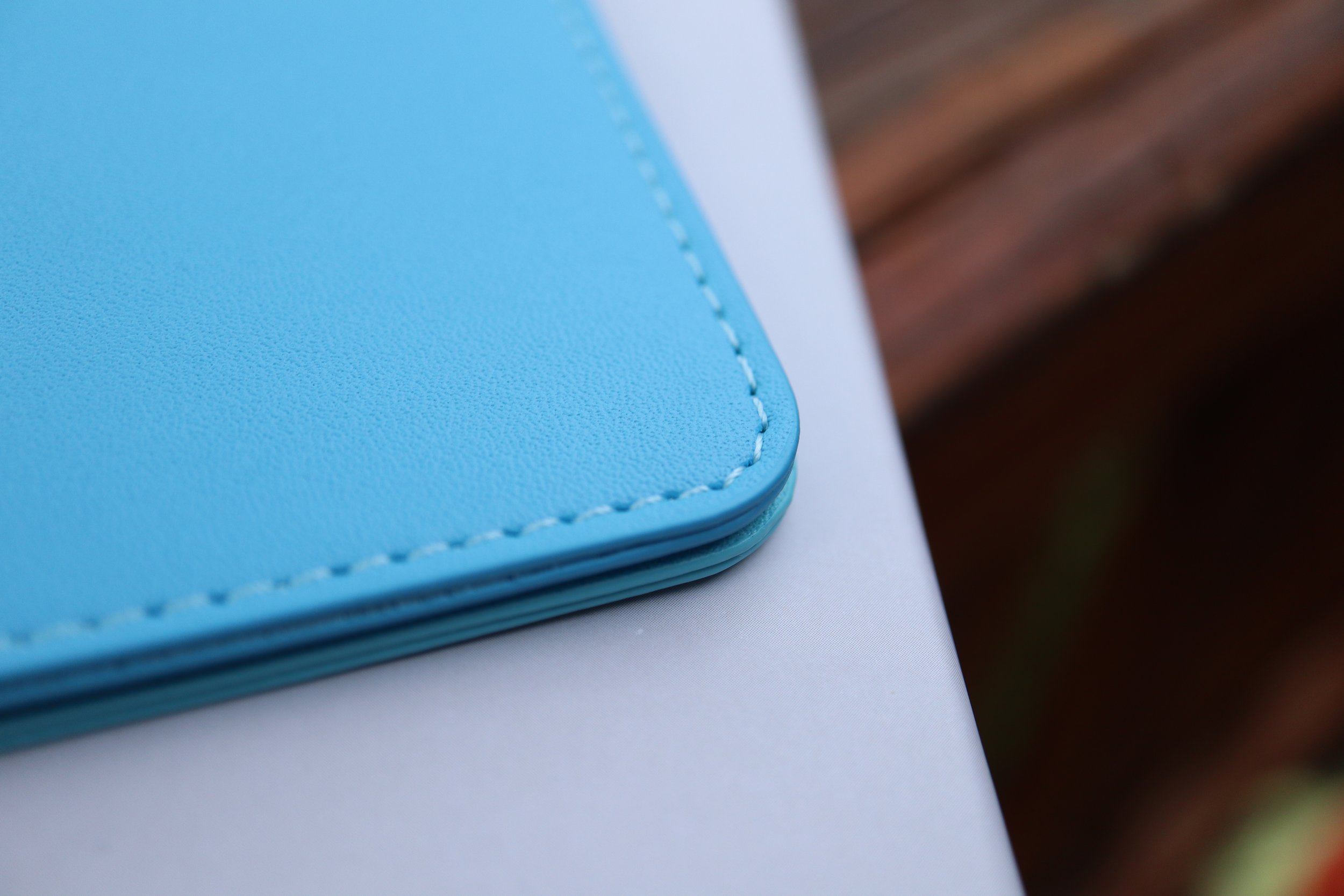
It comes in a pretty unassuming box with San Francisco font, and the wallet inside is in a plastic sleeve, nothing else. Pretty basic packaging. The wallet itself though is made very well and would make an Apple designer pleased, minus the fact that it is made of vegan leather. The surfaces have a nice even texture and the inner lining is smooth. There is no spot on this wallet where you feel a rough edge or notice any sort of poor stitching. Since this is a low volume product, I can see that careful attention to detail was a top priority.
The wallet is essentially two sleeves stitched together, but you wouldn’t notice that just from looking at it from the front or the rear. I only have six plastic cards and one paper card in my current wallet, and this wallet can handle that in each pocket with ease. Having seven cards in each pocket will probably stretch out the wallet permanently, so my seven total cards will still keep it pretty slim with room to grow. That being said, the minimalist design of this wallet makes it more suitable for those who carry less, since this wallet’s whole purpose is form over function.
One thing that confused me was the website description; it says two pockets under the description, but the image next to it says three slim pockets. Technically there is a third, vestigial pocket which is the stitching joining the two main pockets, but it isn’t very useful. It is a great place to put an emergency bill of cash for those instances where cash is king. I was able to fold up a $1 bill into a square and fit it in there.
My main concern with this wallet is to see how durable it is. Will it fall apart? Will it discolor easily? I have made it my daily driver wallet for now, so I will see how it holds up after one month. Stay tuned.
I was scrolling through Twitter and came across this wallet that I just had to have. I mean, what could be cooler than a wallet shaped like a Mac folder? The price was pretty steep at $60, but it truly is a unique product that you won’t find anywhere else. The FOMO in me picked it up immediately, but now you can get it for $50.
It comes in a pretty unassuming box with San Francisco font, and the wallet inside is in a plastic sleeve, nothing else. Pretty basic packaging. The wallet itself though is made very well and would make an Apple designer pleased, minus the fact that it is made of vegan leather. The surfaces have a nice even texture and the inner lining is smooth. There is no spot on this wallet where you feel a rough edge or notice any sort of poor stitching. Since this is a low volume product, I can see that careful attention to detail was a top priority.
The wallet is essentially two sleeves stitched together, but you wouldn’t notice that just from looking at it from the front or the rear. I only have six plastic cards and one paper card in my current wallet, and this wallet can handle that in each pocket with ease. Having seven cards in each pocket will probably stretch out the wallet permanently, so my seven total cards will still keep it pretty slim with room to grow. That being said, the minimalist design of this wallet makes it more suitable for those who carry less, since this wallet’s whole purpose is form over function.
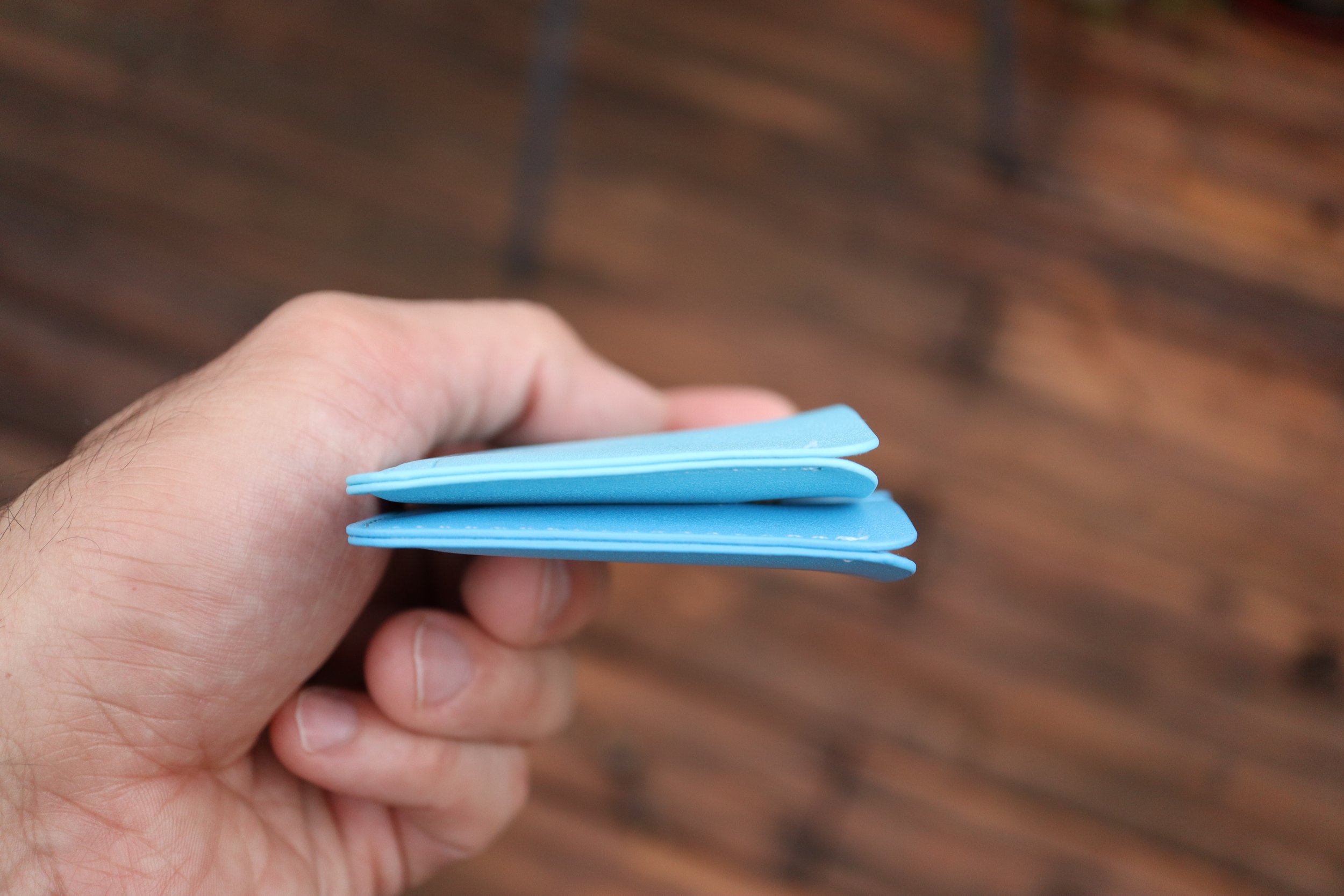
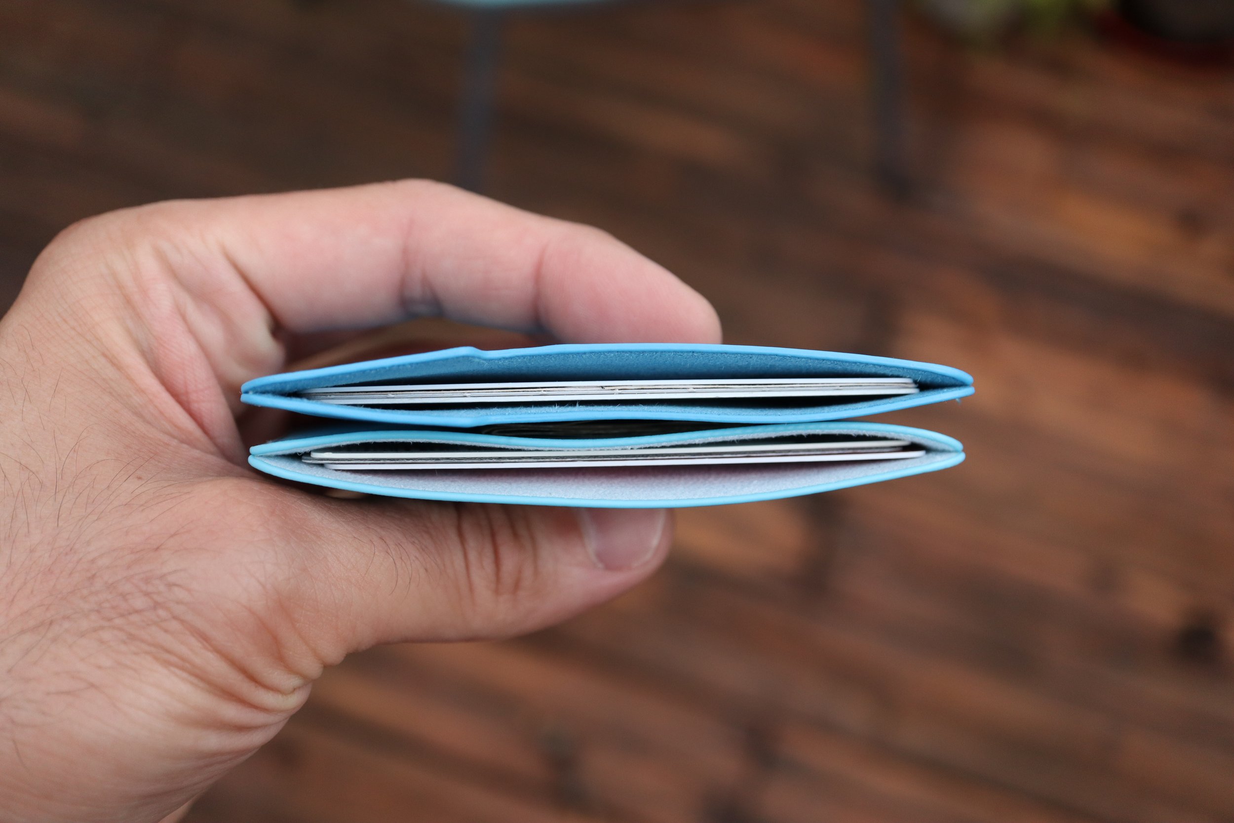
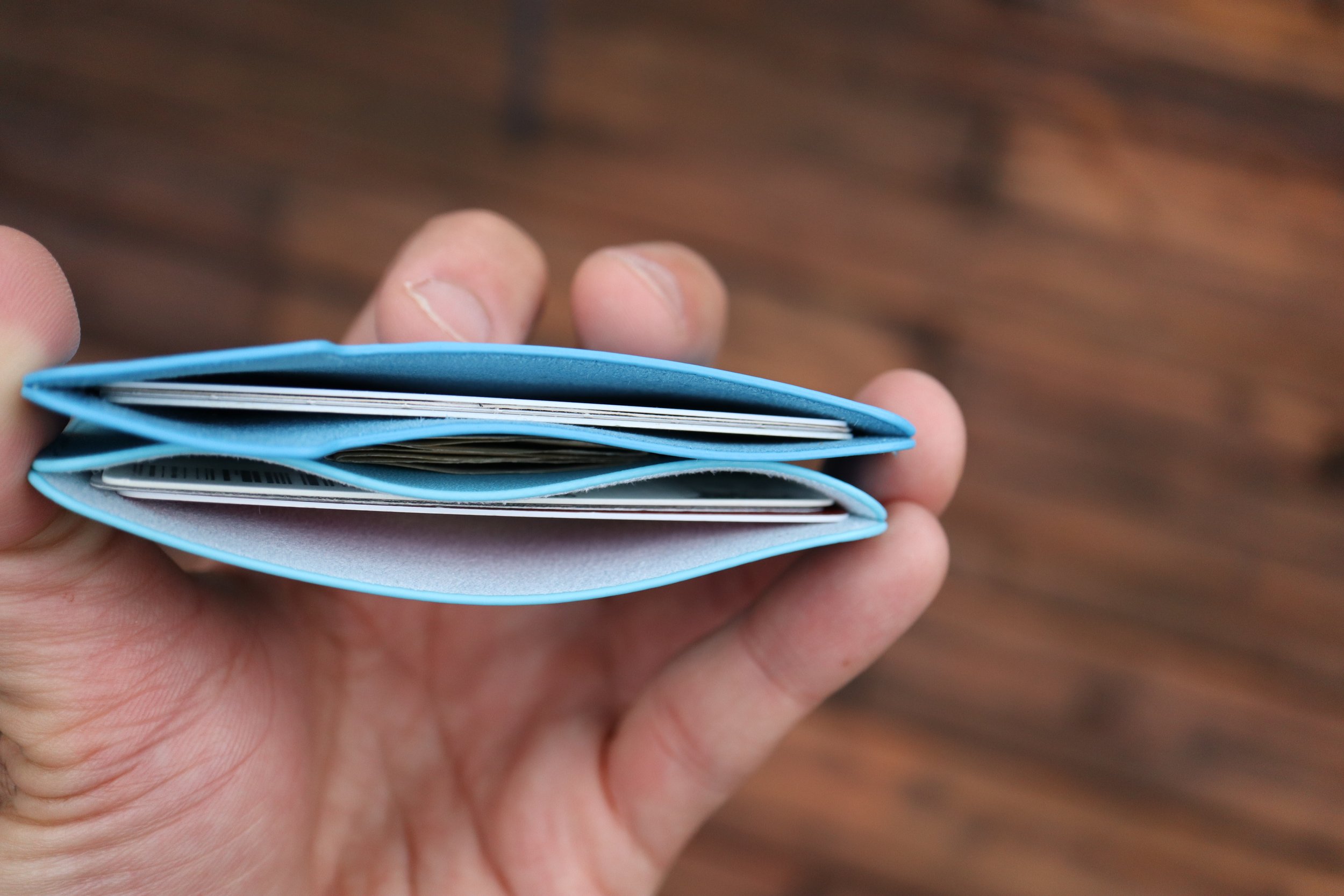
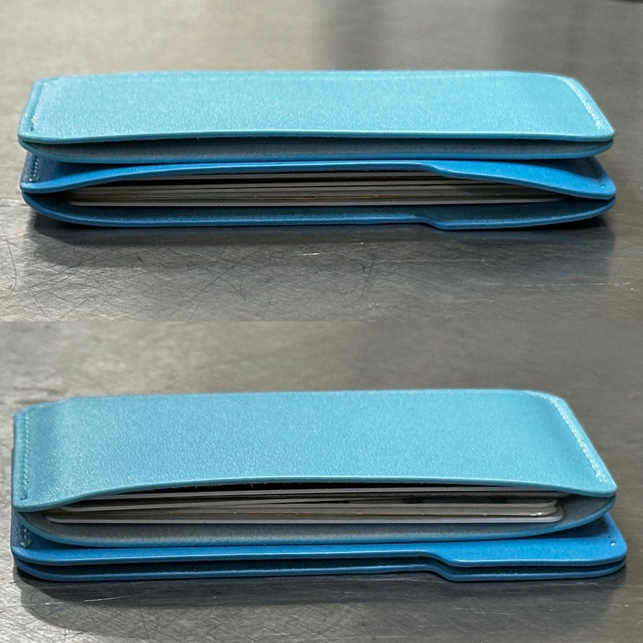
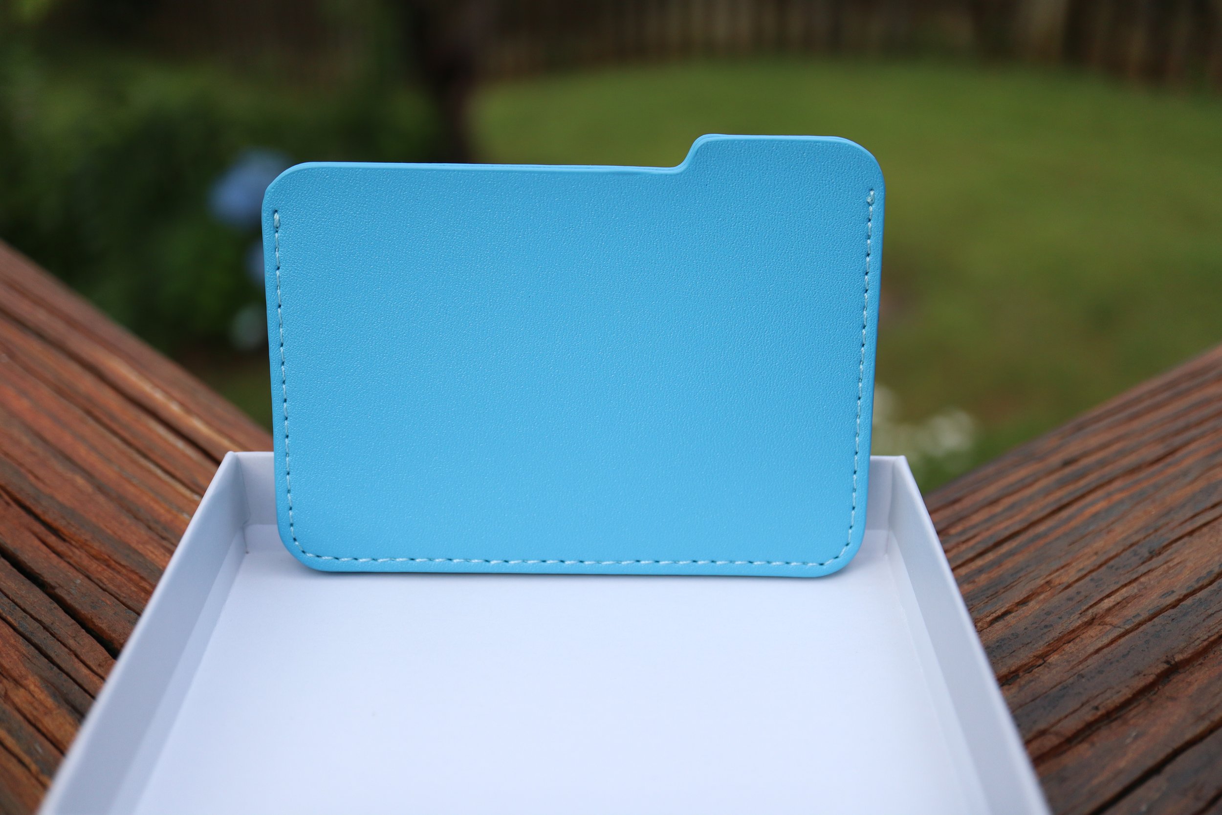
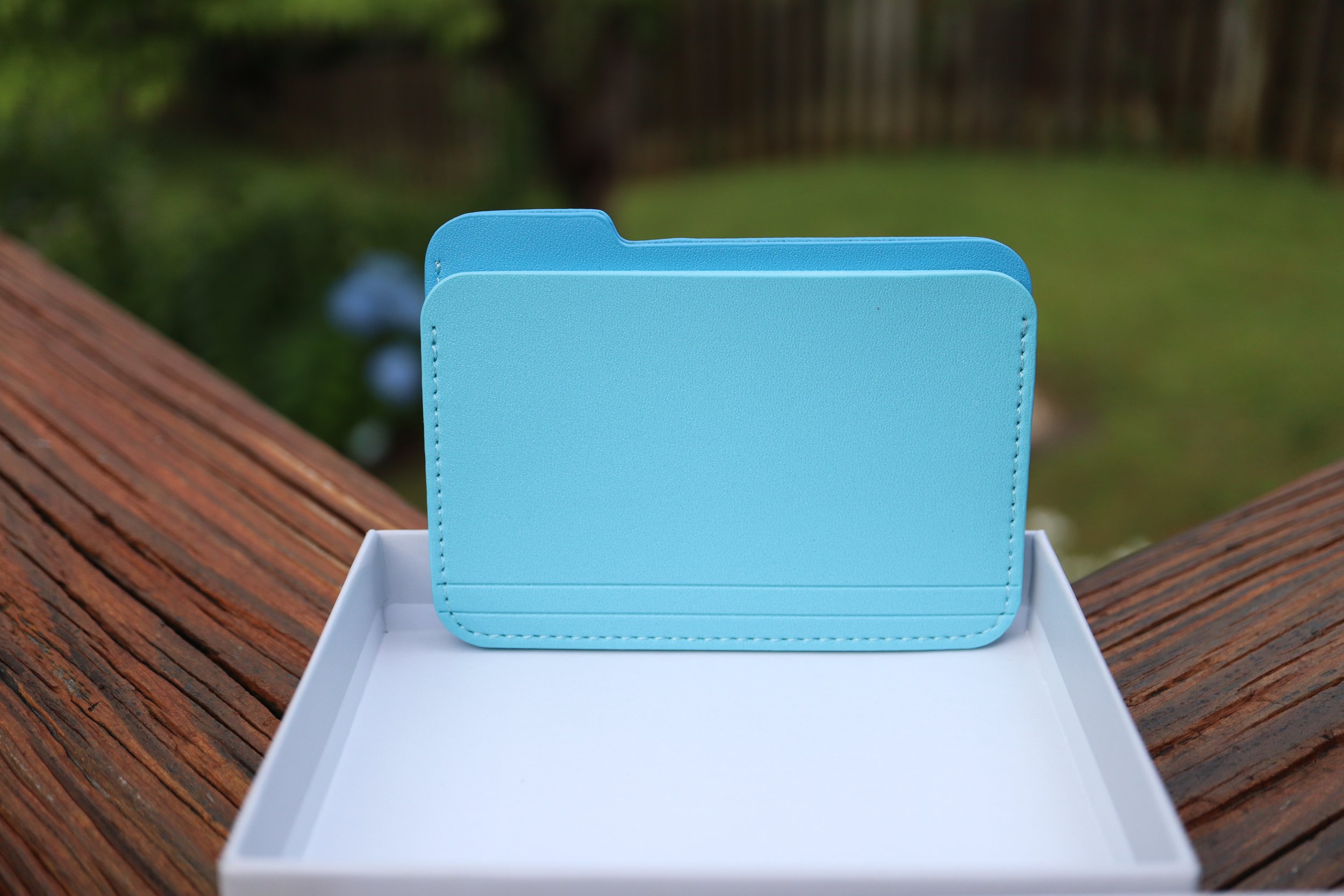

One thing that confused me was the website description; it says two pockets under the description, but the image next to it says three slim pockets. Technically there is a third, vestigial pocket which is the stitching joining the two main pockets, but it isn’t very useful. It is a great place to put an emergency bill of cash for those instances where cash is king. I was able to fold up a $1 bill into a square and fit it in there.
My main concern with this wallet is to see how durable it is. Will it fall apart? Will it discolor easily? I have made it my daily driver wallet for now, so I will see how it holds up after one month. Stay tuned.
watchOS 10 - a huge mental shift for veteran Apple Watch users.
I have been a veteran Apple Watch user since its release in 2015 and after almost two weeks, I still have trouble remembering the controls in watchOS 10. It is going to be a decent learning curve for those upgrading from watchOS 9, but it will also be a fresh start for those who are new to the Apple Watch experience.
In this post, I’m going to go through every single input option on the Apple Watch, and let you know the differences to expect when you upgrade to watchOS 10. Before we get into the input options, know that watchOS 10 essentially has 3 separate layers that flow from one to another. They flow in the following order:
Note: watchOS 10 Developer Beta 1 was used for this writeup.
I have been a veteran Apple Watch user since its release in 2015 and after almost two weeks, I still have trouble remembering the controls in watchOS 10. It is going to be a decent learning curve for those upgrading from watchOS 9, but it will also be a fresh start for those who are new to the Apple Watch experience.
In this post, I’m going to go through every single input option on the Apple Watch, and let you know the differences to expect when you upgrade to watchOS 10. Before we get into the input options, know that watchOS 10 essentially has 3 separate layers that flow from one to another. They flow in the following order:
Smartstack is new with watchOS 10, and it’s very robust and almost looks like a new watch face in and of itself. If you divide the watch into 4 quadrants, you get a clock in the top right, the day and date in the top left, and the bottom half of the watch lets you add up to 8 widgets. Each widget is the size of the big, full-width complication in the modular watch face.
Okay, so let’s get to all the control changes in watchOS 10.
Touch Controls
Swiping down from the top of the screen - this is the same on both watchOS 9 and 10. You get to see your notifications like normal. No retraining here.
Swiping up from the bottom
watchOS 9 - Control Center.
watchOS 10 - you get the new Smart Stack feature. Keep scrolling past Smart Stack to enter your app grid/list. This is a huge mind shift for veteran watch users, and I still get annoyed when I realize that I’m doing it wrong when trying to access Control Center.
Swiping left to right (or right to left)
watchOS 9 - This changes your watch face at the flick of a finger.
watchOS 10 - Changing your watch face in this manner is unexplainably removed from the first beta. I really hope it will be added back because you now have to touch and hold the watch face (like an animal!) as if you wanted to edit the watch face in order to change your watch face. This is a HUGE step back, and I am 100% confident that we will get back the swipe right or left to change the watch faces function in a future beta.
Touch and hold - This is the same for watchOS 9 and 10. It takes you right into the edit screen for the watch face, and the digital crown can be used to cycle between watch faces.
Physical Controls
Action button (Apple Watch Ultra)
This works the same as before in both watchOS 9 and 10. A single click activates whatever app you have set it to, and pressing and holding it activates the Siren/SOS/Power off screen.
Side button (single tap)
watchOS 9 - activates your Dock, which shows either your favorite apps or your most recent apps.
watchOS 10 - activates Control Center, which will confuse people in the beginning. Press it again to close Control Center.
Side button (double tap) - activates your wallet for payments on both watchOS 9 and 10.
Side button (touch and hold) - same function for watchOS 9 and 10. Activates your Siren/SOS/Power off screen. You can still force close your active app by pressing and holding the digital crown while on this screen.
Digital crown (single click)
watchOS 9 - brings your app grid or list.
watchOS 10 - brings up your app grid or list. In watchOS 10 the app grid is now much better since it only scrolls vertically. There is no full 360 degree customization of the placement of your app grid, so it’s much easier to find apps and much more streamlined for those new to the Apple Watch.
Digital crown (double click)
watchOS 9 - would cycle between your two most recent apps with a pretty classy transition, zooming out to the app grid, finding the other app in the grid, and zooming back in.
watchOS 10 - opens your most recent apps in a card-like fashion, similar to the Dock in watchOS 9.
Digital crown (click and hold) - activates Siri in both watchOS 9 and 10.
Digital crown (rotation)
watchOS 9 - lets you interact with specific watch face quirks and features. For example, you can make the numbers long or short on the metropolitan face, or you can rotate through the lunar calendar of the lunar watch face.
watchOS 10 - the digital crown behaves just like swiping up from the bottom of your screen. It brings up your Smart Stack and when you scroll past your Smart Stack, you can scroll right into your app grid/list. You can reverse scroll from the bottom of your app grid and make it all the way back to your watch face as well.
In order to interact with your watch faces such as metropolitan or the lunar watch face, you first need to tap the watch face, and then you will see the complications and the watch hands fade into the background, letting you know that the digital crown can now be used to interact with the watch face. This is one of the biggest control changes in watchOS 10, and will probably confuse people who did interact with their watch faces a lot.
The good news for new Apple Watch users is that they will be on a more level playing field with veterans when it comes to learning the controls of their watch. The bad news is if you have older relatives who are not tech-savvy and they currently have an Apple Watch, they will flock to you for help. But that's OK because that’s what we do as tech enthusiasts. We can be their digital hero and reconnect with our loved ones at the same time.
Testing Apple's Drug Interaction Checker - How Accurate is it?
Note: These features were tried on iOS 16.5, and on iOS 17 Developer Beta 1.
I tried to put Apple’s drug interaction checker to the test, and let me start off by saying that overall it does a good job of catching interactions. It’s not perfect though, and can even be dangerous. That is why you should always consult your care team to determine if any medications need to be stopped or changed based on your health situation.
With that being said, let me set the scenario here.
I used a bunch of drugs to test out Apple’s system, and to see how well it can track drug interactions and interaction factors.
Note: These features were tried on iOS 16.5, and on iOS 17 Developer Beta 1.
I tried to put Apple’s drug interaction checker to the test, and let me start off by saying that overall it does a good job of catching interactions. It’s not perfect though, and can even be dangerous. That is why you should always consult your care team to determine if any medications need to be stopped or changed based on your health situation.
With that being said, let me set the scenario here.
I used a bunch of drugs to test out Apple’s system, and to see how well it can track drug interactions and interaction factors. First, let’s check out the list of drugs:
Crestor (generic name is rosuvastatin) - cholesterol medicine.
Zocor (generic name is simvastatin) - this is the same drug category as above, used for cholesterol medicine.
Simvastatin - literally the same drug as Zocor.
Rifampin - used for treating tuberculosis.
Lisinopril - blood pressure medication.
Accutane - for severe acne.
Chantix - for smoking cessation.
Promethazine VC with Codeine - used to treat cold, stuffiness, and allergy symptoms.
After putting in your medications, you get a list of drug interactions that pop up. When you enter the interactions page, you will see “Current Factors” at the top. These life factors can look for interactions between your medications and said life factors. Apple currently provides three life factors:
Alcohol consumption
Marijuana
Tobacco
With all life factors turned OFF, there was 1 Serious and 4 Moderate interactions.
After turning ON all 3 Interaction Factors, the number of interactions increased to 8 Serious and 4 Moderate, which is no surprise.
Although technically all of the drug interactions are present, there are fine details that many people might not be aware of. A thorough pharmacy based system would find a few more discrepancies.
Let’s look at my list of drugs from above once again:
Crestor (generic name is rosuvastatin) - cholesterol medicine.
Zocor (generic name is simvastatin) - this is the same drug category as above, used for cholesterol medicine.
Simvastatin - literally the same drug as Zocor.
Rifampin - used for treating tuberculosis.
Lisinopril - blood pressure medication.
Accutane - for severe acne.
Chantix - for smoking cessation.
Promethazine VC with Codeine - used to treat cold, stuffiness, and allergy symptoms.
Drugs 2 and 3 are duplicates, and drug 1 is in the same category as 2 and 3. In a pharmacy drug utilization review system, these 3 drugs would pop-up as 2 or even 3 separate drug interactions, and would require consultation with the patient. Odds are the patient is stopping one medication and starting another, or they have switched from a brand name to a generic. Apple’s interaction checker however doesn’t give you these warnings.
Does Apple’s drug interaction checker screen for pregnant patients?
In its current version of iOS 17 Developer Beta 1, Apple’s drug interaction checker is not designed to screen for pregnant patients. Here’s the process that I used to find out.
I changed my gender in the Health app to female and added an active pregnancy that is currently nearing 3 months. I wanted to trigger more life factor interactions, since some of these drugs on my list are a big no no during pregnancy.
After adding my pregnancy status, I still had the same 8 severe and 4 moderate interactions. I even gave the phone a few days to perhaps “sync” the pregnancy information and maybe it would trigger some sort of alert. After a few days, I checked the drug interaction checker again and it still had the same 8 severe and 4 moderate interactions. There was nothing in the medications section indicating that Apple was aware that I was pregnant, and there was nothing in the pregnancy section that triggered any alerts based on my drug profile and substance use. There was no warning to stop drinking alcohol, or to stop using tobacco or cannabis due to direct fetal harm, even though I was “using” all those substances.
Now let’s disregard the life factors and just think about the medications and the active pregnancy. If these drugs were in a patient’s profile at a pharmacy and the patient had a pregnancy status of positive, the computers would sound red alarms:
Let’s look at the list of drugs again (for the 3rd time now!):
Crestor (generic name is rosuvastatin) - cholesterol medicine.
Zocor (generic name is simvastatin) - this is the same drug category as above, used for cholesterol medicine.
Simvastatin - literally the same drug as Zocor.
Rifampin - used for treating tuberculosis.
Lisinopril - blood pressure medication.
Accutane - for severe acne.
Chantix - for smoking cessation.
Promethazine VC with Codeine - used to treat cold, stuffiness, and allergy symptoms.
Drugs 1, 2, and 3 would be considered very high risk to the fetus.
Drug 5 is considered Pregnancy Category D, which means positive evidence of human fetal risk.
Drug 6 is considered Pregnancy Category X (not allowed at all during pregnancy), and with this drug in particular there is up to a 35% chance of severe birth defects.
As you can see from such a patient drug profile, a successful pregnancy would most likely not happen.
Now in fairness to Apple, they do state the following to let people know that not all interactions might be caught by the Health app:
“Health is not able to check for all potential interactions. More information is available on the labels of your medications. Discuss any questions about your medications with your care team.”
Is Apple’s drug interaction checker flawed?
Right now, Apple’s drug interaction checker works in a bubble. It can take hundreds of drugs, along with the life factors of alcohol, tobacco, and cannabis use, and spit out every interaction between these factors.
While I believe that Apple has made great progress by adding a medication log and even providing drug interactions, it still requires more work. The pregnancy section of the Health app needs to talk to the medications section in order to make it a more robust and reliable system that holistically looks at the person’s health. I believe this is a work in progress for Apple, and in due time they will get there since they have a strong focus on health and fitness.
Even when Apple does get there, remember to always seek professional advice from your healthcare team in regards to your medications and health concerns.
Apple’s “One More Thing” is just not the same anymore…
When Apple revealed its Vision Pro spatial computing device, the initial sequence of events at the Keynote just weren’t as exciting as in the past. When Tim Cook mentioned that we have, 'One More Thing,' there was no usual fanfare, there was no cheering, and there was no anticipation that happens with a live event. In the live events before COVID, the camera angles change, people are shown smiling, sitting at the edge of their seats waiting for the unveiling of the next big thing. You also got to see all those tech journalists frantically typing away which gave you another reality perspective!
I know I know, Apple technically does have live events at Apple Park, but they are still just watching a screen and the reactions are not part of the keynote for everyone to enjoy.
Apple always does a great job revealing their products and the main intro video revealing the Vision Pro was no exception. The next scene right after that though, it’s just Tim Cook in an empty theater. There is no audience that is standing and cheering, no fist pumps, no high fives, it’s all gone. Instead they cut right into the pre-recorded videos talking about the product. Imagine how insane it would have been if the event were live, and Tim Cook came out wearing the Vision Pro, with his 'real' digital eyes looking at everyone!
This wasn’t just another Apple Event. This was a 'One More Thing’ moment, and the last one was 6 years ago in 2017 when the iPhone X was revealed. The last ‘One More Thing’ event that was a new product category was in 2014 with the Apple Watch. As you can see, these moments just don’t happen that often.
It is definitely more efficient to have the pre-recorded stream, but sometimes efficiency gets in the way of the true to life character of the speaker. It’s like when I talk to my kids and I get to see their reactions to my dad jokes, the expression on their faces is priceless to me. If I were to script that same event and tell them to react the same way, it just wouldn’t be the same. It’s not a reaction anymore, but just a prompt.
If Apple plays it's cards like they did with the Apple Watch reveal, they will have another event sometime early next year to give more details about the Vision Pro. With all due respect to those who make these amazing pre-recorded streams, I still really hope that event is an actual live in-person event so we can get some of that impromptu spark and humor back. I mean just look at this clip of Joz during the iPhone SE reveal, where he talks about the iPhone SE’s camera and describes the guy on the skateboard as Phil Schiller’s doppelganger. I thought that was hilarious.
Apple Vision Pro - What is the True Cost?
Apple revealed their Vision Pro headset on Monday, and one of the biggest concerns people have about it is the $3,499 price tag. Everyone keeps saying that it is way too expensive, but no one has really mentioned the fact that Apple stated:
“Apple Vision Pro, starts at $3,499.”
Did you catch that? That’s right, it STARTS at $3,499.
So what will be the true “out the door” price? We can only speculate, but let’s gather some numbers.
I’m going to say that AppleCare+ for the Apple Vision Pro will be around $500. I know that sounds crazy, but hear me out. If the $5,000 ProDisplay XDR which is a stationary product, costs $500 for AppleCare+, it really isn’t a far fetch to assume that the Apple Vision Pro will have a similar price. The Apple Vision Pro is more prone to bumps, drops, and is probably more delicate with all its sensors and cameras. I don’t normally tell people to buy AppleCare+ (even though I do buy it myself), but I would strongly recommend everyone to get AppleCare+ this time around because the Vision Pro is an amazing piece of technology that will cost you big time if you break it. I would say that out of warranty coverage would be $999, since it sounds psychologically better than $1,000. This is being reasonable when you consider that an iPhone 14 Pro Max screen replacement out of warranty is $379. That is 34% of the cost of the base model iPhone Pro Max. With that extrapolation, the Vision Pro out of warranty repair would be $1,200, but I’m “optimistic” at $999.
Let’s talk about that charging brick with magnetic cable. You get one with the headset, and you will want to buy another one because it is another proprietary magnetic charging system. You don’t have any spares lying around, and most of your friends won’t either. God forbid you lose it or damage it and then have to wait forever to get another one if they’re on backorder. Considering Apple charges $100 for the MagSafe battery pack, this is much more significant and sophisticated with a higher capacity battery, so let’s be generous and call it $200 for the brick. The cable seems to be detachable from the brick, so let’s add another $50 for the cable. On the plus side, the charging brick does look elegant, and even looks like the original iPhone.
What about memory upgrades? Let’s hope that the Vision Pro starts at at least 256GB. Add $200 for 512GB and another $200 for 1TB. I’m basing this from iPhone pricing. I would probably keep the base storage option for myself.
How about a nice stand to keep your Apple Vision Pro looking smug and fresh, and to prevent it from sliding around on your desk. Let’s price that at $100. How about a carrying case for when you’re on the go, just like the lady in the hotel room in Apple’s keynote? I mean after all, not that many people will have this device, so you can show it to your family and friends, but you don’t want to wear it across town. Another $100.
Do you wear glasses? Well, you have to purchase special lens inserts that attach magnetically to the Vision Pro. Those are rumored to be around $300-600 per Mark Gurman.
So far, our total is $4,450 without lens inserts, and $4,750 with lens inserts (assuming $300):
Apple Vision Pro - $3,500
AppleCare+ - $500
Extra charging brick - $200
Extra charging cable - $50
Apple Vision Pro Stand - $100
Carrying case - $100
Custom prescription lens inserts - $300-$600
Let’s stop there. Now let’s add sales tax which averages to 5%. Our grand final total is a whopping $4,673 without lens inserts, and $4,987 with lens inserts.
I haven’t even gotten into the different head band options that will probably be available, but you can easily expect each band to cost around $100. Once again, I think I’m being generous with this price because those much tinier Apple Watch Ultra bands also start at $99.
You can see how this $3,500 device can easily creep into the $5,000 mark. Even the people who were able to stomach the $3,500 price tag might think twice when the costs get that high.
I primarily wear glasses, but I do wear contacts when I play sports. Let’s see what the cost of those Zeiss lenses are before I go full throttle on contact lenses.


